Project 9: Emotion Check-In Journal
Build a local-only emotion journal that lets kids check in with simple icons and stickers.
Quick Reference
| Attribute | Value |
|---|---|
| Difficulty | Level 2 (Intermediate) |
| Time Estimate | 1-2 weeks |
| Main Programming Language | Swift (Alternatives: Objective-C, JavaScript React Native, C# Unity) |
| Alternative Programming Languages | Objective-C, JavaScript React Native, C# Unity |
| Coolness Level | Level 2 (Practical but Forgettable) |
| Business Potential | Level 2 (Micro-SaaS / Pro Tool) |
| Prerequisites | Project 6 privacy concepts |
| Key Topics | Privacy-first UX, emotional design, local storage |
1. Learning Objectives
By completing this project, you will:
- Design an emotional check-in flow that feels safe and non-judgmental.
- Store sensitive data locally without personal identifiers.
- Create a parent summary that protects privacy.
- Build a calm visual style with supportive feedback.
2. All Theory Needed (Per-Concept Breakdown)
Privacy-First Emotional UX
Fundamentals
Emotional apps for kids require extra care. The child should feel safe, not evaluated. The UI must be gentle, the language must be neutral, and the experience should avoid ranking or scoring. An emotion check-in is not a test. It is a moment of reflection.
Privacy is critical. Emotional data is sensitive. The safest approach is to store everything locally and avoid text input for younger kids. Use icons, colors, or stickers instead of free-form text. This reduces risk while still allowing expression.
A parent summary should be aggregated, not detailed. Parents may want to see patterns, but you should avoid exposing exact entries or timestamps unless necessary. A weekly count of emotions is enough. This protects the child while giving parents useful information.
Emotional safety depends on language and tone. The prompts should be warm and neutral. Avoid words like “correct” or “wrong” in the context of feelings. This framing encourages honesty rather than performance.
Visual design should be calm. Soft colors and rounded shapes help create a safe environment. Avoid flashing animations or loud sounds. The emotional check-in should feel like a gentle pause in the day.
Another fundamental is consent. Even though this project stores data locally, parents should understand what is stored. A short explanation in the parent zone builds trust and aligns expectations.
Emotional vocabulary varies across families. You can keep the set of emotions small and widely understood. For example: happy, calm, sad, angry, and tired. This reduces confusion and keeps the check-in short.
Some children may have difficulty labeling emotions. You can support them by including simple icons and optional audio labels. The audio should be a clear, friendly voice that says the emotion word once. This supports recognition without adding complexity.
Another foundational issue is neutrality. The app should not present one emotion as a goal. All emotions should be treated equally in color, size, and placement. This visual neutrality is just as important as neutral text.
The check-in should be short enough to complete in under a minute. Long flows can make children restless and reduce honesty. Keep the number of steps minimal and avoid extra questions. This is a reflection tool, not a survey.
Also consider inclusive emotion options. Some children might not identify with basic labels. Including a neutral or “unsure” option can be helpful and avoids forcing a choice.
The visual tone should match the purpose. Use soft gradients or gentle solid colors and avoid harsh contrasts. This helps children feel calm while interacting with emotional content.
If you include an “unsure” option, present it with the same visual weight as the other emotions. This signals that it is a valid choice and reduces pressure to pick a specific label.
Keep navigation minimal so the child can complete a check-in without getting lost.
Simple navigation reduces cognitive load and supports honest responses.
Avoid long menus or multiple screens. One primary screen and one optional parent screen is enough.
Short, friendly prompts keep the experience gentle.
Deep Dive into the Concept
Emotional UX for children is about psychological safety. The interface must communicate that all emotions are valid. Avoid labels like “good” or “bad.” Instead, use neutral emotion words and supportive visuals. For example, a “sad” icon should not look scary; it should look gentle and friendly. The colors should be calming, not intense.
The check-in flow should be short and simple. A good flow is: choose an emotion icon, pick a sticker or color, then finish. This lets the child express feelings without requiring writing. For older kids, you might allow optional text, but that introduces privacy risk. For a kids app, especially under 13, avoid text unless you have strong reasons and parental consent.
Data modeling is a key design decision. Each entry can be a simple record: date, emotion icon, optional sticker. No name or description is required. This minimal data approach is consistent with privacy laws and app store guidelines. You should also define retention rules. For example, keep only the last 30 days, or allow parents to clear data easily. This limits risk.
Parent summaries should respect the child experience. A summary might show “3 happy, 2 calm, 1 sad” for the week. This is enough for parents to notice trends without exposing details. If you show individual entries, a child might feel monitored. The goal is to support, not to surveil.
The UX should also avoid any form of reward that implies certain emotions are better. For example, do not give badges for being happy. That sends the wrong message. Instead, reward the act of checking in with a small neutral animation, like a soft sparkle, regardless of which emotion was chosen.
A calm visual design is important. Use soft colors, large icons, and minimal clutter. The child should not feel rushed. Avoid timers or streaks. The experience should feel like a safe pause, not a game.
There is also an accessibility component. Some children may have difficulty interpreting facial expressions. You can include optional labels or audio prompts, such as “I feel calm.” This helps children who need verbal support, but keep it optional so the UI stays simple.
From an engineering perspective, ensure that local storage is secure and stable. Even though you are not encrypting in this project, you should avoid unnecessary data. Also avoid syncing or uploading. If you later add cloud sync, you must revisit consent and compliance.
This project also introduces emotional tone in copywriting. Every prompt should be supportive. For example: “How do you feel today?” rather than “Report your mood.” These small wording choices shape how children feel about the app.
The choice to avoid free-form text is a key privacy decision. Text can include names, addresses, or other sensitive details. For younger kids, icons and stickers provide enough expressive power without exposing personal information. For older kids, optional text could be added, but that would require a careful consent flow and a more robust privacy policy.
Aggregated summaries protect privacy while still providing value. A weekly count of emotions can help parents notice trends. If you include timestamps or daily logs, you increase sensitivity. Keep summaries broad and allow parents to clear data easily.
Accessibility is important. Some children may need audio prompts to understand the emotion labels. A small speaker icon can read the emotion aloud when tapped. This feature should be optional and should not introduce tracking or data collection.
Finally, remember that this app is not therapy. It is a tool for reflection. The design should avoid diagnostic language and should not claim to measure wellbeing. This keeps the app ethically safe and aligned with store guidelines.
Data lifecycle is a core privacy issue. If the app keeps entries forever, the risk increases. A simple retention rule such as “keep last 30 days” limits exposure. Parents should be able to clear data at any time.
Parent guidance can be added as a short note in the parent zone, such as “These summaries are for awareness, not diagnosis.” This keeps expectations realistic and ethically safe.
If you decide to allow older children to add text, you must treat that text as sensitive data. It should never leave the device, and parents should be informed. For this project, it is safer to avoid text entirely, but you should understand why the decision matters.
The parent summary can include gentle guidance such as “Use these summaries as a conversation starter.” This is not just UX copy; it sets expectations and reduces the risk of parents interpreting the data too strongly.
If you provide a parent summary, consider adding a “conversation tip” section with a single neutral suggestion. This is optional but can guide parents toward supportive dialogue. Keep tips generic and non-clinical.
For data safety, consider clearing sticker choices if the child exits before saving. This prevents partial entries from cluttering the summary and keeps the data set clean and simple.
You should also consider edge cases like multiple check-ins in one day. Decide whether to allow them or limit to one. Either approach is fine, but it must be consistent and clearly communicated to parents.
In the parent zone, avoid advice that sounds clinical. Keep language simple and supportive, such as “Try asking your child about their day.” This keeps the app in a safe, non-medical space.
If parents want more detail, provide it only after explicit opt-in within the parent zone. This keeps privacy as the default and avoids accidental exposure.
If a parent clears data, show a brief confirmation message so they understand the reset happened intentionally. This avoids confusion and reinforces trust.
If you provide a simple weekly summary chart, keep it low-detail, such as a row of colored dots. This shows trends without exposing specific dates or entries. The simpler the summary, the safer the data.
If parents export or copy summaries, keep them anonymized and avoid identifying details. This maintains the privacy-first posture even outside the app.
Keep these summaries simple and consistent.
How this Fits in the Project
This project applies privacy-first design to a sensitive domain. It combines local storage, gentle UX, and parent summaries into one system.
Definitions & Key Terms
- Emotional UX: Design that supports feelings without judgment.
- Minimal data: Collecting only what is necessary.
- Aggregated summary: Grouping data to avoid personal details.
- Neutral reinforcement: Feedback that does not favor a specific emotion.
Mental Model Diagram (ASCII)
Emotion Choice -> Optional Sticker -> Save Entry -> Parent Summary (aggregated)
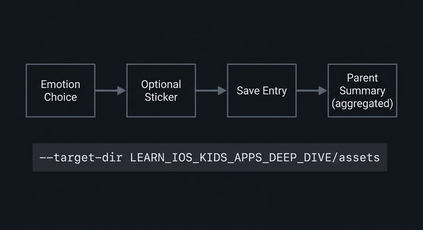
How It Works (Step-by-Step)
- Child selects an emotion icon.
- Child adds a sticker or color.
- Entry is saved locally.
- Parent zone shows weekly aggregation.
Invariants:
- No personal identifiers are stored.
- All emotions are treated equally.
Failure modes:
- Overly detailed data stored.
- Parent summary exposes too much detail.
Minimal Concrete Example (Pseudocode)
ON emotionSelect:
  SET currentEmotion

ON stickerSelect:
  SAVE entry {date, emotion, sticker}

ON parentSummary:
  COUNT emotions by type
Common Misconceptions
- “More detail helps parents.” Too much detail can break trust.
- “Text is necessary.” Icons can be enough for young kids.
- “Rewards increase engagement.” Rewards can distort emotional honesty.
Check-Your-Understanding Questions
- Why should emotional data be minimal?
- What is a safe parent summary?
- Why avoid rewarding specific emotions?
Check-Your-Understanding Answers
- It reduces privacy risk and sensitivity.
- An aggregated weekly count by emotion type.
- It implies judgment and discourages honest expression.
Real-World Applications
- Social-emotional learning tools
- Classroom check-in apps
- Family reflection routines
Where You Will Apply It
- In this project: see Section 3.7 Real World Outcome and Section 5.10 Implementation Phases.
- Also used in: Project 6 for parent zones.
References
- Apple App Store Review Guidelines (Kids Category)
- “Design It!” by Michael Keeling - Ch. 2
Key Insight
Emotional apps for kids must prioritize safety and privacy over features.
Summary
The emotion check-in journal is a privacy-first, supportive tool. The design goal is to create a calm space, not a scoreboard.
Homework / Exercises to Practice the Concept
- Write three neutral prompts for an emotion check-in.
- Design an icon set for five emotions.
- Define a weekly summary that avoids personal details.
Solutions to the Homework / Exercises
- “How do you feel right now?” “Pick a feeling.” “Choose a color for today.”
- Simple faces with clear expressions, soft colors.
- Counts by emotion type only.
3. Project Specification
3.1 What You Will Build
A daily emotion check-in with icons, optional stickers, and a parent summary panel behind a gate.
3.2 Functional Requirements
- Emotion selection: Choose one of five icons.
- Sticker selection: Add a sticker or color.
- Local storage: Save entries locally only.
- Parent summary: Show weekly counts in parent zone.
3.3 Non-Functional Requirements
- Performance: Fast and responsive.
- Reliability: Entries persist across restarts.
- Usability: Calm, uncluttered UI.
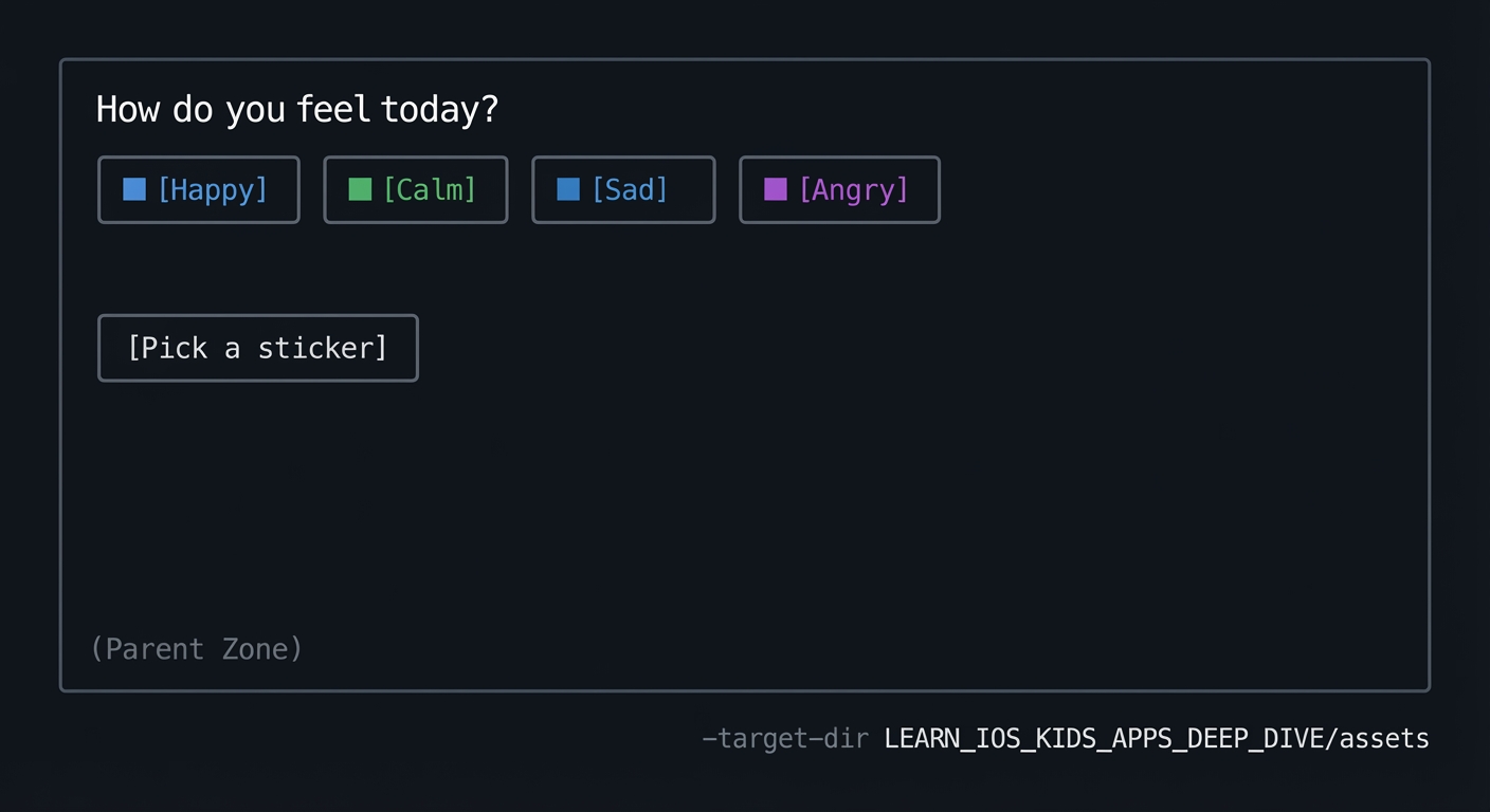
3.4 Example Usage / Output
ASCII wireframe:
+----------------------------------+
| How do you feel today?           |
| [Happy] [Calm] [Sad] [Angry]     |
|                                  |
| [Pick a sticker]                 |
|                                  |
| (Parent Zone)                    |
+----------------------------------+
3.5 Data Formats / Schemas / Protocols
- Entry: { date, emotion_id, sticker_id }
- WeeklySummary: { emotion_id -> count }
3.6 Edge Cases
- No entry for a day
- Parent clears data
- Child taps multiple emotions
3.7 Real World Outcome
3.7.1 How to Run (Copy/Paste)
- Run in iPhone simulator.
3.7.2 Golden Path Demo (Deterministic)
Scenario: Child selects “Calm” and a sticker.
Expected behavior:
- Entry saved locally.
- Calm count increases by 1 in parent summary.
3.7.3 Failure Demo (Deterministic)
Scenario: Child attempts to open parent zone without gate.
Expected behavior:
- Parent zone remains locked.
- Child returns to emotion screen.
3.7.4 Mobile UI Details
- Large emotion icons in a row.
- Sticker picker below.
- Parent zone button in corner.
4. Solution Architecture
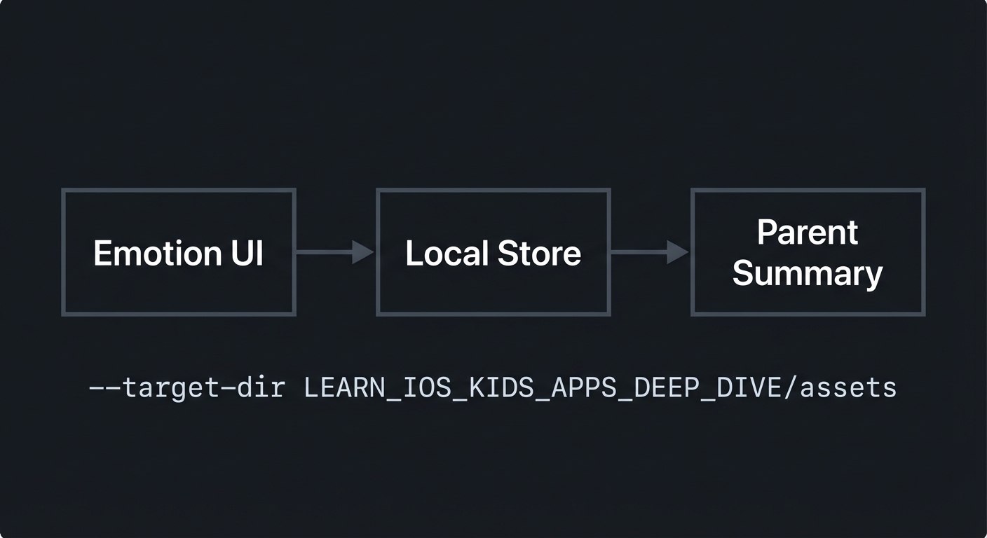
4.1 High-Level Design
+-------------+      +------------------+      +------------------+
| Emotion UI  | ---> | Local Store      | ---> | Parent Summary   |
+-------------+      +------------------+      +------------------+
4.2 Key Components
| Component | Responsibility | Key Decisions |
|---|---|---|
| Emotion Picker | Selects emotion | Large icons |
| Sticker Picker | Adds optional expression | Minimal set |
| Local Store | Saves entries | Local only |
| Parent Summary | Aggregates data | Counts only |
4.3 Data Structures (No Full Code)
- EntryList: list of entries
- SummaryMap: emotion -> count
4.4 Algorithm Overview
Key Algorithm: Weekly Summary
- Filter entries by last 7 days.
- Count each emotion type.
- Display aggregated counts.
Complexity Analysis:
- Time: O(E) per summary
- Space: O(E) for entries
5. Implementation Guide
5.1 Development Environment Setup
xcodebuild -version
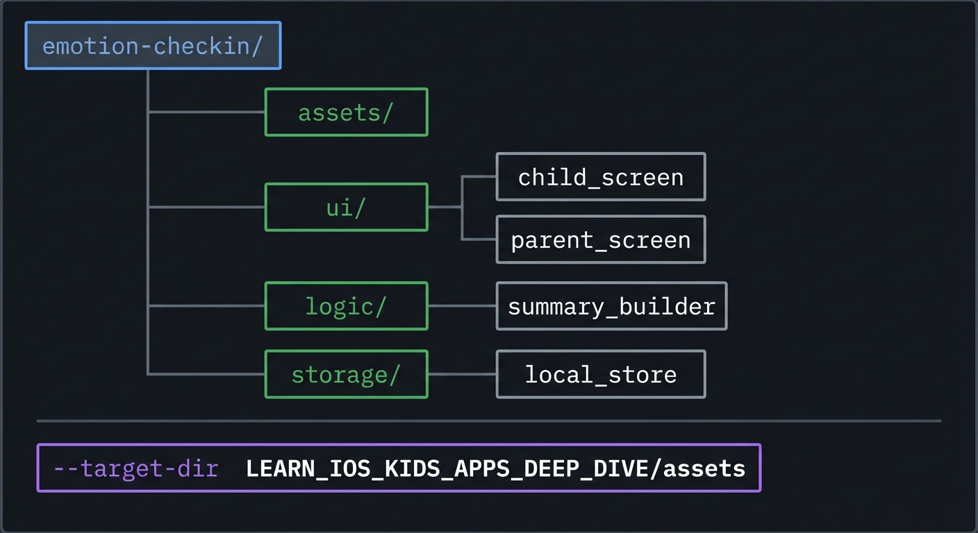
5.2 Project Structure
emotion-checkin/
+-- assets/
+-- ui/
|   +-- child_screen
|   `-- parent_screen
+-- logic/
|   `-- summary_builder
`-- storage/
    `-- local_store
5.3 The Core Question You’re Answering
“How can I let kids express feelings while protecting their privacy?”
5.4 Concepts You Must Understand First
- Privacy-first data design
- What data is essential vs optional?
- Book Reference: “Clean Architecture” - Ch. 1
- Supportive emotional UX
- How do you avoid judgment in UI?
- Book Reference: “Design It!” - Ch. 2
5.5 Questions to Guide Your Design
- Data model
- What is the minimal entry record?
- Parent summary
- How can it be informative without being intrusive?
5.6 Thinking Exercise
Neutral Feedback
Write two phrases that reinforce the check-in without judging the emotion.
5.7 The Interview Questions They’ll Ask
- “Why should emotional data be minimal?”
- “How do you design non-judgmental feedback?”
- “What makes a parent summary safe?”
- “How do you handle missing days?”
- “How do you store data locally?”
5.8 Hints in Layers
Hint 1: Use icons Avoid text inputs for younger kids.
Hint 2: Keep entries small Only store emotion and date.
Hint 3: Aggregate for parents Show counts, not details.
Hint 4: Add a reset option Parents can clear data if needed.
5.9 Books That Will Help
| Topic | Book | Chapter |
|---|---|---|
| Privacy | “Clean Architecture” | Ch. 1 |
| UX | “Design It!” | Ch. 2 |
5.10 Implementation Phases
Phase 1: Foundation (3-5 hours)
Goals:
- Emotion picker UI
- Local storage
Tasks:
- Create emotion icon row.
- Save selection locally.
Checkpoint: One entry saved and loaded.
Phase 2: Core Functionality (6-8 hours)
Goals:
- Sticker picker
- Parent summary
Tasks:
- Add sticker picker.
- Build summary screen.
Checkpoint: Summary shows weekly counts.
Phase 3: Polish & Edge Cases (4-6 hours)
Goals:
- Parent gate
- Reset
Tasks:
- Add gate to parent zone.
- Add reset confirmation.
Checkpoint: Parent zone secure and functional.
5.11 Key Implementation Decisions
| Decision | Options | Recommendation | Rationale |
|---|---|---|---|
| Emotion set | 5 vs 8 emotions | 5 | Simplicity |
| Data detail | Full text vs icon | Icon only | Privacy |
| Summary | Full entries vs counts | Counts | Safety |
6. Testing Strategy
6.1 Test Categories
| Category | Purpose | Examples |
|---|---|---|
| Unit | Summary counts | Weekly totals |
| Integration | Gate flow | Parent access |
| Edge Case | No entries | Empty summary |
6.2 Critical Test Cases
- Entry saved and persists after restart.
- Parent summary aggregates last 7 days.
- Gate blocks parent zone access.
6.3 Test Data
Entries: happy, calm, sad over 3 days
7. Common Pitfalls & Debugging
7.1 Frequent Mistakes
| Pitfall | Symptom | Solution |
|---|---|---|
| Too much detail | Privacy risk | Store minimal fields |
| Judgmental wording | Child discomfort | Neutral language |
| Ungated summary | Child access | Add gate |
7.2 Debugging Strategies
- Inspect stored entries manually.
- Simulate week with missing days.
7.3 Performance Traps
- Large sticker libraries can slow UI; keep small.
8. Extensions & Challenges
8.1 Beginner Extensions
- Add more stickers.
8.2 Intermediate Extensions
- Add color themes per emotion.
8.3 Advanced Extensions
- Add anonymous multi-profile support.
9. Real-World Connections
9.1 Industry Applications
- SEL classroom tools
- Family reflection apps
9.2 Related Open Source Projects
- Look for mood trackers with local storage.
9.3 Interview Relevance
- Privacy-first architecture
- Sensitive UX design
10. Resources
10.1 Essential Reading
- “Clean Architecture” - Ch. 1
- “Design It!” - Ch. 2
10.2 Video Resources
- Talks on ethical design for kids
10.3 Tools & Documentation
- Apple HIG for wellness apps
10.4 Related Projects in This Series
11. Self-Assessment Checklist
11.1 Understanding
- I can explain minimal data design.
- I can explain why emotional UX must be neutral.
- I can explain aggregated summaries.
11.2 Implementation
- Entries persist locally.
- Parent zone is gated.
- Summary is correct.
11.3 Growth
- I can propose improvements for older kids.
- I can explain this project in an interview.
12. Submission / Completion Criteria
Minimum Viable Completion:
- Emotion picker with local save
Full Completion:
- Parent summary and gate
Excellence (Going Above & Beyond):
- Multi-profile support and advanced summaries