Kid-Safe iPhone Apps (Games and Learning) Mastery - Real World Projects
Goal: Build a deep, first-principles understanding of how to design and ship iPhone apps for kids that are safe, age-appropriate, and genuinely fun to use. You will learn how kid-centered UX, privacy compliance, and iOS architecture fit together, and how to translate that into working apps you can test on real devices and submit to the App Store. By the end, you will be able to create small games and educational experiences with clear learning outcomes, offline-first progress tracking, and parental controls. You will also understand the App Store rules that specifically apply to kids apps, including parental gates and data-minimization requirements.
Introduction
- What is this topic? It is the craft of building iOS apps (iPhone and iPad) designed for children, including small games, storybooks, and educational tools.
- What problem does it solve today? It gives kids safe, engaging, and effective learning experiences while protecting their privacy and avoiding manipulative design patterns.
- What will you build across the projects? Ten apps that progressively add game loops, learning progress, audio, accessibility, and parental controls.
- What is in scope vs out of scope?
- In scope: SwiftUI-first UI, kid-safe UX, offline data storage, audio/animation feedback, simple game loops, App Store Kids Category compliance.
- Out of scope: large multiplayer backends, ad-tech, complex 3D engines, aggressive monetization.
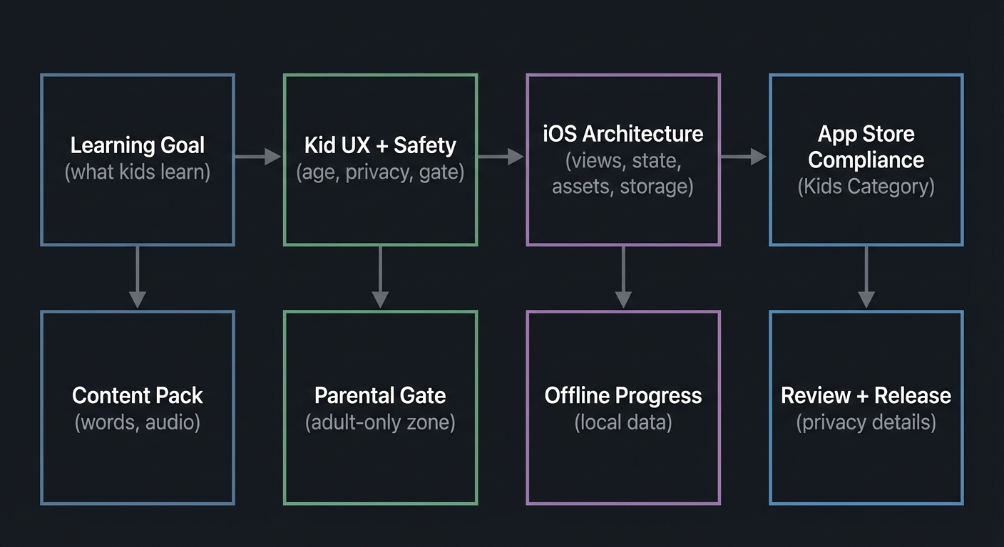
Big-picture system view (idea to App Store):
+------------------+    +---------------------+    +-------------------+    +-----------------+
| Learning Goal    | -> | Kid UX + Safety     | -> | iOS Architecture  | -> | App Store        |
| (what kids learn)|    | (age, privacy, gate)|    | (views, state,    |    | Compliance       |
|                  |    |                     |    | assets, storage)  |    | (Kids Category)  |
+------------------+    +---------------------+    +-------------------+    +-----------------+
          |                         |                        |                      |
          v                         v                        v                      v
     Content Pack            Parental Gate             Offline Progress        Review + Release
     (words, audio)          (adult-only zone)          (local data)            (privacy details)
How to Use This Guide
- Read the theory primer before starting projects so you build the right mental models.
- Pick a learning path that matches your goals (games-first, education-first, or compliance-first).
- After each project, validate using the Definition of Done and the real-world outcome section.
Prerequisites & Background Knowledge
Essential Prerequisites (Must Have)
- Basic programming fundamentals (variables, loops, functions, simple data structures).
- Comfort installing tools on macOS and using a terminal.
- Recommended Reading: “Clean Code” by Robert C. Martin - Ch. 1-3 (naming, functions, and clarity).
Helpful But Not Required
- Basic UI/UX design vocabulary (learn during Projects 2 and 3).
- Simple game design concepts (learn during Projects 4 and 5).
Self-Assessment Questions
- Can you explain the difference between application state and UI representation?
- Can you describe how a button press should update state and trigger a UI change?
- Can you name two ways to store small data locally on a device?
Development Environment Setup
Required Tools:
- Xcode 16 or later (meets current App Store Connect upload requirements).
- iOS 18 or later Simulator (installed with Xcode).
Recommended Tools:
- A physical iPhone or iPad for touch testing.
- A simple audio editor for voice prompts and sound effects.
Testing Your Setup:
$ xcodebuild -version
Xcode 16.x
Build version
Time Investment
- Simple projects: 4-8 hours each
- Moderate projects: 10-20 hours each
- Complex projects: 20-40 hours each
- Total sprint: 3-6 months
Important Reality Check
Building for kids is not just “small apps.” You must design for short attention spans, limited reading ability, and strong privacy constraints. App Store review for kids apps is stricter than normal. Expect to iterate on UX and compliance requirements more than on raw code.
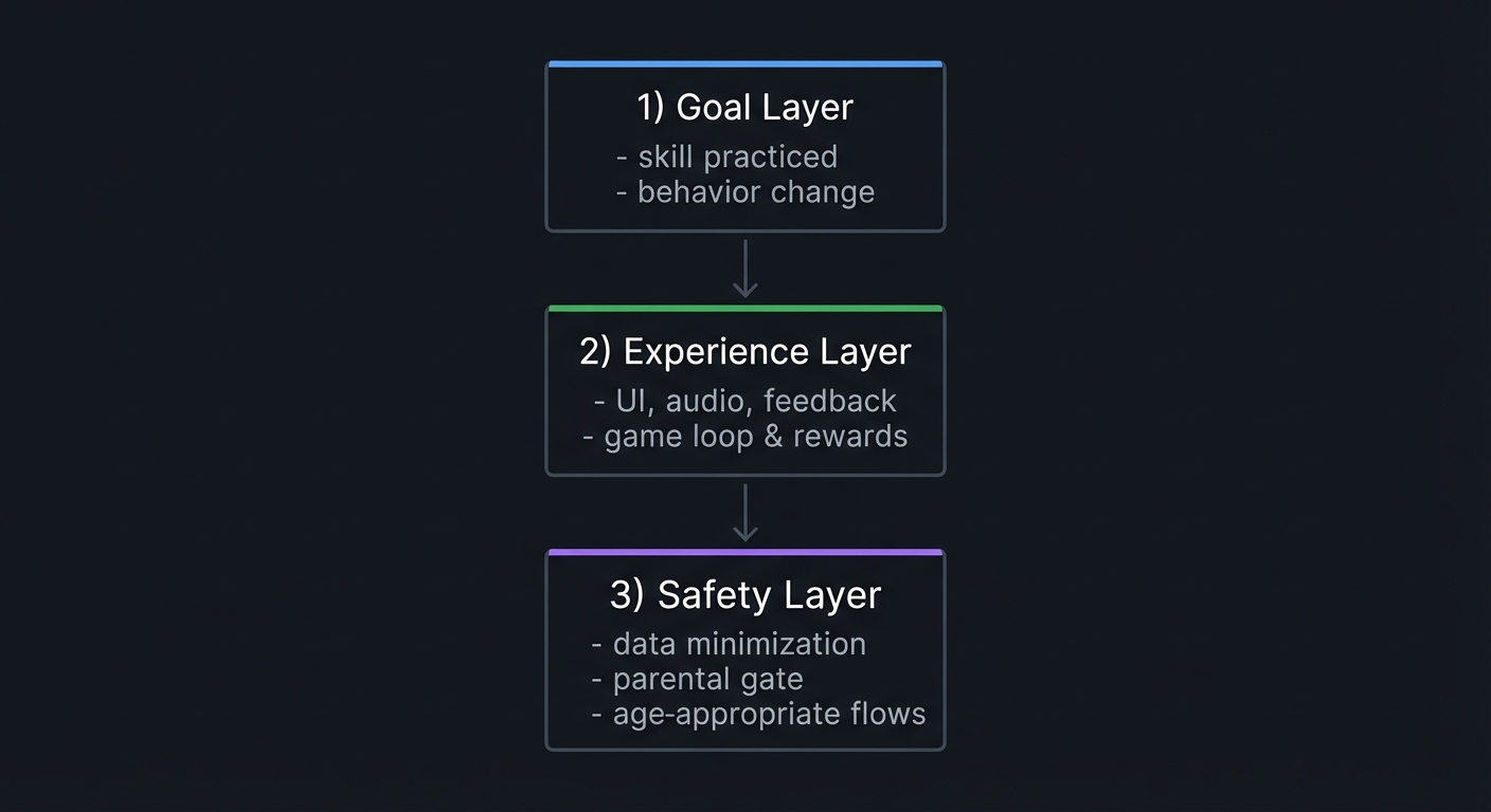
Big Picture / Mental Model
Think of every kids app as a three-layer system: 1) Learning or play goal (what the child should feel or learn) 2) Experience layer (visuals, audio, feedback, pacing) 3) Safety layer (privacy rules, parental gates, data minimization)
If any layer is weak, the app fails either for the child, the parent, or App Store review.
+-------------------------+
| 1) Goal Layer           |
| - skill practiced       |
| - behavior change       |
+-------------------------+
            |
            v
+-------------------------+
| 2) Experience Layer     |
| - UI, audio, feedback   |
| - game loop & rewards   |
+-------------------------+
            |
            v
+-------------------------+
| 3) Safety Layer         |
| - data minimization     |
| - parental gate         |
| - age-appropriate flows |
+-------------------------+
Theory Primer (Mini-Book)
Chapter 1: Kid-Safe Product Design and Compliance
Fundamentals
Building iPhone apps for kids is fundamentally different from building general-audience apps. You are not just designing for a smaller screen or a shorter attention span. You are designing for a specific legal and ethical context. The users are minors, the audience is often pre-literate, and the parent is a secondary stakeholder who evaluates trust, safety, and clarity. The kid is the primary user, but the parent is the decision-maker who installs, pays, and sets device rules.
The App Store Kids Category is explicitly targeted to children ages 11 and under and requires stronger privacy and safety guarantees than normal apps. Apple requires that kids apps avoid collecting personal information, avoid third-party tracking or advertising, and include parental gates for any action that could take a child outside the safe experience. That means any link out to a website, any purchase, and any settings that could expose personal data must be protected by an adult check. This is not a polite suggestion; it is a policy requirement that is enforced in App Review.
At the legal level in the United States, COPPA (Children’s Online Privacy Protection Act) sets rules for collecting personal information from children under 13. It requires clear notice, verifiable parental consent before collecting personal data, and limits on data retention. The FTC has recently finalized updates to COPPA that expand what counts as personal information and require opt-in consent for targeted advertising to children. Even if you do not plan to collect data, you must understand these requirements because adding analytics, crash reporting, or cloud sync can introduce data collection without you realizing it.
The core idea is data minimization. If you can deliver the experience without collecting a child’s data, do that. Prefer offline-only storage, avoid third-party SDKs, and use on-device content. If you must collect data, then you must clearly describe it on your App Store product page and provide a privacy policy. The “Kids Category” has stricter rules than general apps; it limits even the data shared with third parties and restricts advertising formats.
This is why kids app design is always a three-way balancing act: what is fun for the child, what is acceptable to the parent, and what is allowed by the platform rules. You will use this balance throughout every project in this guide.
Deep Dive
Think of compliance as a product design constraint, not just a legal checklist. The safest and most stable approach is to design your product so that it simply does not need to collect data. That means no user accounts, no external social features, no open chat, no location sharing, no behavioral analytics. Instead, use local storage for progress, and treat the device as a private play space.
The first compliance decision happens before you build anything: are you going to select the “Made for Kids” designation in App Store Connect? If you do, you must also pick an age band (5 and under, 6-8, or 9-11) and you cannot change that selection after the app is approved. This is not reversible. It means your product experience must be consistently aligned with the chosen age band across all future updates. Apple also forbids making Kids Category apps available on visionOS, and limits the presence of third-party analytics and advertising. In practice, this means you should build your app as if you will never rely on advertising revenue, and as if every interaction will be reviewed for age appropriateness.
Next, consider the App Store review guidelines. The Kids Category rules explicitly prohibit transmitting personally identifiable information or device identifiers to third parties. In limited cases, third-party contextual advertising or analytics is allowed, but only if it follows strict rules: no IDFA, no location, no identifying info, and documented age-appropriate review practices. The safest path is to avoid these integrations entirely.
Then there is COPPA, which applies to apps directed at children under 13 or to general-audience apps that knowingly collect data from children under 13. COPPA’s definition of personal information is broad: it includes persistent identifiers like device IDs, photos and audio of a child, and geolocation data. If you even collect a child’s voice for a “record and playback” feature, that is personal information under COPPA. The FTC has also clarified that data minimization and limited retention are required, and the 2025 final rule introduces opt-in consent for targeted advertising and expands the definition of personal information to include biometrics. In short: the easiest compliance strategy is to avoid collecting personal data in the first place.
Parent-facing controls are part of the compliance design. A parental gate is not the same as parental consent under COPPA, but it is a required product feature for the Kids Category. A parental gate is an adult-level action that a child is unlikely to solve (for example, a math question or an instruction to hold down two corners for several seconds). You should also use voice prompts or icon-based instructions for pre-literate children. Parental gates should appear before: leaving the app, opening external links, viewing marketing or upsell screens, accessing settings, or making purchases.
Finally, you need to understand App Store privacy disclosures. Apple requires developers to declare what data is collected, how it is used, whether it is linked to the user, and whether it is used for tracking. Even if you are not collecting data, you must verify that third-party libraries are not collecting it on your behalf. A kids app with “no data collected” is easier to explain to parents and easier to pass App Review.
Compliance does not end after the first release. Apple is updating age ratings, parental controls, and privacy policies continuously. For example, Apple has announced updated age rating questions that developers must answer by January 31, 2026 to avoid interruptions to submissions. If you build a kids app, you need to keep up with these platform updates and re-validate your app’s compliance before every submission.
The key mental model: compliance is a design constraint that shapes everything else. By designing for privacy and safety first, you gain trust and reduce App Review risk.
Definitions and Key Terms
- COPPA: U.S. law that protects children under 13 by requiring parental consent before collecting personal information.
- Kids Category: App Store category for apps designed for ages 11 and under with strict privacy and parental gate requirements.
- Parental Gate: An adult-only action that blocks a child from making purchases, leaving the app, or changing settings.
- Personal Information (COPPA): Broad category including name, contact info, persistent identifiers, photos, voice, and precise location.
- Privacy Nutrition Label: The App Store disclosure that summarizes what data your app collects and how it is used.
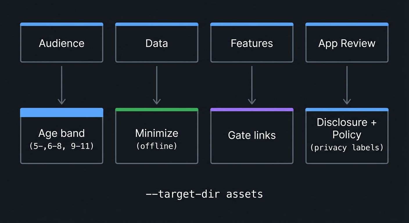
Mental Model Diagram
Compliance as a funnel:
Audience -> Data -> Features -> App Review
   |         |         |         |
   v         v         v         v
Age band  Minimize   Gate   Disclosure + Policy
(5-,6-8,  (offline)  links  (privacy labels)
 9-11)
How It Works (Step-by-Step)
- Decide if the app is directed at children under 13. If yes, COPPA applies.
- Choose whether to select “Made for Kids” in App Store Connect and select an age band.
- Design the app to avoid collecting personal information.
- If any data is collected, determine whether parental consent is required.
- Add parental gates to any feature that can take a child outside the safe core experience.
- Prepare privacy disclosures and a privacy policy that match your data practices.
- Validate all third-party SDKs for compliance.
- Submit to App Review and respond to any questions about child safety or data use.
Invariants:
- Kids apps should not transmit personal or device information to third parties without parental consent.
- Parental gates must exist before external links, purchases, or settings.
- App Store privacy disclosures must match actual data behavior.
Failure modes:
- A third-party SDK collects identifiers, causing a Kids Category rejection.
- A settings screen is reachable without a gate, triggering a rejection.
- The app requests data but provides no privacy policy.
Minimal Concrete Example (Pseudocode)
Parental gate flow:
IF child taps “Parent Zone” SHOW gate challenge (e.g., “Hold top-left and top-right for 5 seconds”) IF challenge completed SHOW settings and external links ELSE RETURN to main play screen
Data minimization checklist:
IF feature can be completed without accounts USE local storage only ELSE REQUIRE parental consent flow LOG consent with timestamp
Common Misconceptions
- “If I do not ask for a name, I am not collecting personal information.” False: device identifiers and audio recordings can count.
- “A parental gate equals parental consent.” False: COPPA consent requires explicit notice and verifiable consent.
- “Kids Category is optional so it does not matter.” False: if your app is clearly for kids, App Review can still enforce Kids rules.
Check-Your-Understanding Questions
- Why is a parental gate required even if your app does not collect data?
- What kinds of data can trigger COPPA compliance besides a child’s name?
- Why is it risky to include third-party analytics in a kids app?
Check-Your-Understanding Answers
- Because the Kids Category requires adult-only barriers before purchases, external links, and settings.
- Persistent identifiers, audio recordings of a child, geolocation, and photos all count as personal information.
- Third-party SDKs can collect identifiers or tracking data that violate Kids Category rules.
Real-World Applications
- Educational flashcard apps that run fully offline.
- Storybook apps with parental gates for external content.
- Kids games that avoid third-party analytics and ads.
Where You Will Apply It
Projects 1-10, especially Projects 3, 6, 8, and 10.
References
- Apple App Store Review Guidelines (Kids Category, 1.3, 5.1.4)
- Apple “Design safe and age-appropriate experiences” (Kids Category page)
- App Store Connect Help: Age rating and Made for Kids selection
- FTC COPPA guidance and FAQs
- FTC Final Rule updates (January 2025)
- Apple App Privacy Details documentation
Key Insight
If you design for privacy and safety first, the rest of the app becomes simpler, more trustworthy, and easier to ship.
Summary
Compliance is not a legal afterthought. It is the foundation that shapes the design, data model, and user flows of kids apps. The safest strategy is to avoid collecting personal data entirely and to enforce parental gates wherever a child could escape the safe play area.
Homework / Exercises
- Draft a “no-data” product plan for a kids app and list any features that would force data collection.
- Design a parental gate that a 4-year-old cannot solve but a parent can complete in 5-10 seconds.
- Write a one-paragraph plain-language privacy policy for an offline kids game.
Solutions to the Homework / Exercises
- Remove accounts, avoid analytics, store progress locally, and avoid external links.
- Use a two-corner press-and-hold or a multi-step math prompt with voice guidance.
- State that the app collects no personal information, stores progress only on the device, and does not share data.
Chapter 2: iOS App Architecture for Kids Apps (SwiftUI, State, and Offline Data)
Fundamentals
iOS apps are made of views (what you see) and state (the data that drives those views). SwiftUI makes this explicit: views are a function of state. When state changes, the UI changes. This is a powerful mental model for kids apps because children need immediate feedback. A button press should instantly update what they see and hear. A correct answer should produce a positive response the moment it happens. To build this reliably, you must design state carefully.
Kids apps are also content-heavy. You will store words, images, sounds, and progress. Because you should avoid collecting personal data, most storage is local. That means your architecture must handle offline-first data: assets bundled in the app, user progress stored locally, and predictable app behavior even without network access.
The architecture should be simple, layered, and testable. A common pattern is:
- UI layer: screens, animations, controls.
- State layer: the current level, score, progress, settings.
- Content layer: word lists, audio clips, images.
- Storage layer: on-device persistence and cache.
The child should never see complex loading states, error popups, or network failures. If you need external content, preload it or gracefully degrade.
Deep Dive
Start by choosing your UI framework. SwiftUI is the current best default for new iOS apps because it encourages declarative UI and clear state flow. It also makes accessibility easier when you use standard components. UIKit is still relevant, especially for more complex custom drawing and game mechanics, but SwiftUI is enough for most educational apps and small games.
Your state model should be explicit and finite. For children, unexpected transitions cause confusion. Define the app as a series of screens or “scenes” with clear transitions. A scene could be “Intro”, “Play”, “Success”, or “Try Again”. Each scene has inputs (user actions) and outputs (visual feedback, sound, state changes). This is a state machine. Even if you do not implement it formally, you should design with that mindset.
Local data storage can be as simple as key-value storage for progress, or as structured as a local database. For kids apps, avoid user accounts. Instead, store progress per device. If you need multiple profiles (for siblings), store a list of profiles with cartoon avatars, not personal information. Use simple identifiers that are not tied to real names.
Asset management is critical. Kids apps use images, audio, and animations. Organize assets by theme and level. Use consistent naming conventions so your content team (or your future self) can maintain the library. Audio should be normalized in volume to avoid startling sound changes.
Performance is not optional. A laggy experience breaks immersion and frustrates children. Minimize frame drops and pre-load assets where possible. Avoid large memory spikes. Use lightweight animations and compress audio files appropriately. If you use SpriteKit or another game engine, keep the scene graph simple.
Accessibility is part of architecture. Use system fonts and dynamic type, keep tap targets large, and ensure voice prompts are clear. If the app is meant for pre-literate children, rely on iconography and audio guidance rather than text. The architecture must allow for multiple output channels: visual, audio, and haptic.
Finally, consider testing. Kids apps benefit from observation-based testing: watch a child try to use the app and note where they get stuck. From a technical standpoint, you should also test deterministic outcomes: a set of inputs should always produce the same result. In a game, randomness should be controlled by a seed so you can reproduce issues.
Definitions and Key Terms
- Declarative UI: UI described as a function of state rather than imperative drawing commands.
- State Machine: A model where the app exists in discrete states with defined transitions.
- Offline-First: Design that assumes no network is available and stores all progress locally.
- Content Pack: A structured set of assets (images, audio, text) that define a level or theme.
- Scene: A logical screen or game state with its own inputs and outputs.
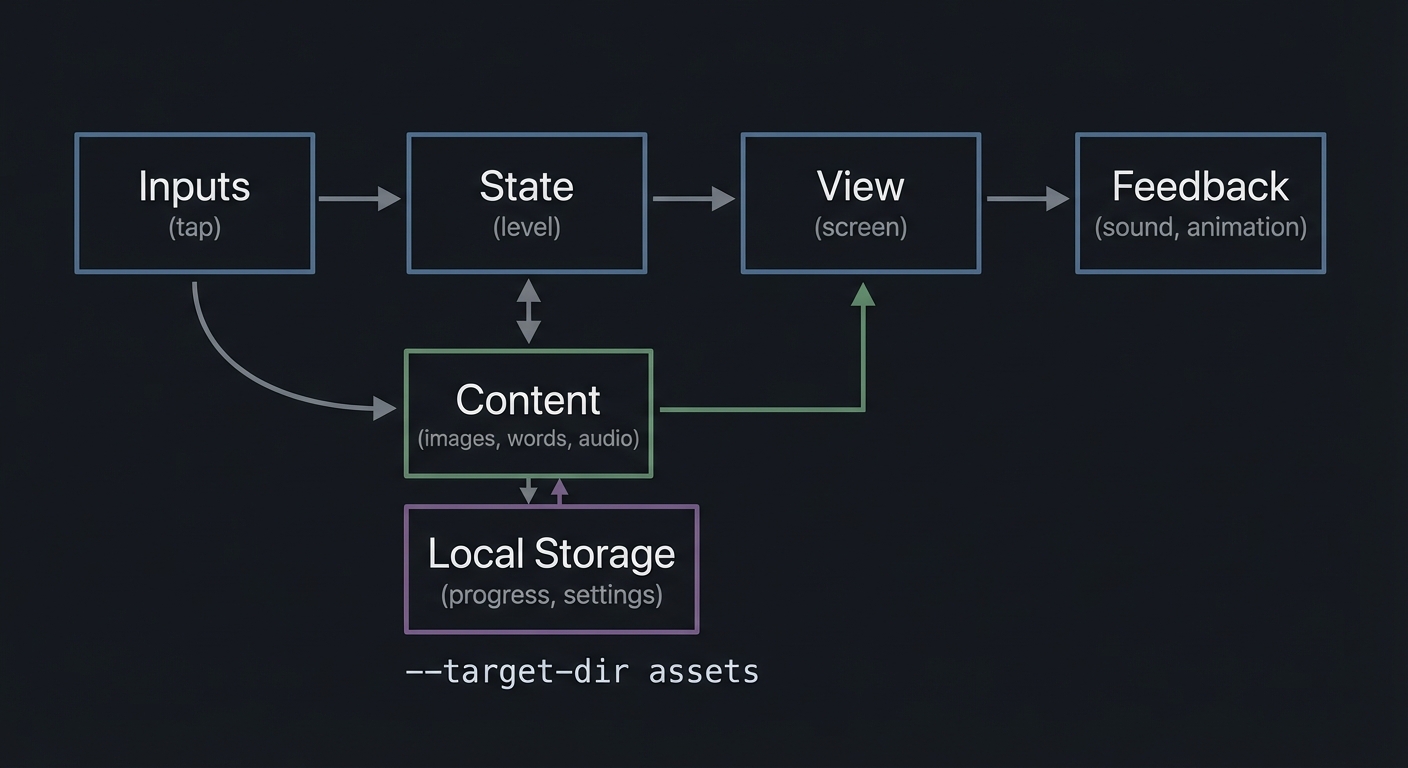
Mental Model Diagram
View-State-Content pipeline:
Inputs -> State -> View -> Feedback
 (tap)   (level)  (screen) (sound, animation)
    \                ^
     \               |
      \-> Content ----
          (images, words, audio)

Storage sits beneath state:

State <-> Local Storage (progress, settings)
How It Works (Step-by-Step)
- Define the core learning loop (e.g., show prompt, take input, give feedback).
- Model the loop as explicit states (prompt, waiting, success, retry).
- Bind views to state so UI changes on state updates.
- Store progress locally with simple, non-identifying keys.
- Load assets at startup or scene boundaries to avoid lag.
- Use audio and visual feedback as part of the state transition.
- Test with deterministic inputs and record performance.
Invariants:
- UI is always derived from the current state.
- State transitions are controlled and predictable.
- Offline mode still delivers a complete experience.
Failure modes:
- State updates out of sync with UI (confusing feedback).
- Asset load delays cause blank screens or stutters.
- Progress not saved, causing child frustration.
Minimal Concrete Example (Pseudocode)
State model for a matching game:
STATE = “show_cards” ON tap(card): IF first_pick is empty -> store first_pick ELSE CHECK match IF match -> STATE = “celebrate” ELSE -> STATE = “try_again”
When STATE changes: “celebrate” -> play sound, show stars, unlock next level “try_again” -> gentle shake, replay prompt
Common Misconceptions
- “SwiftUI means I do not need to think about state.” False: SwiftUI makes state more explicit, not less.
- “Kids apps do not need architecture.” False: simple apps still require clear state and asset management.
- “Offline-first means no updates.” False: you can still ship updates; you just do not depend on network for core play.
Check-Your-Understanding Questions
- Why is a state machine a good mental model for kids app flows?
- What is the risk of relying on network calls during core gameplay?
- How does offline storage improve both privacy and UX?
Check-Your-Understanding Answers
- It creates predictable transitions and reduces confusing UI jumps.
- Network delays can break the play loop and frustrate children.
- It avoids data collection and ensures progress is always available.
Real-World Applications
- Flashcard apps with instant feedback and offline progress.
- Matching games with deterministic state transitions.
- Storybooks with preloaded audio and images.
Where You Will Apply It
Projects 1-10, especially Projects 2, 4, 5, 7, and 10.
References
- Apple Human Interface Guidelines (SwiftUI and layout basics)
- Apple SwiftUI documentation (state and data flow concepts)
- Apple App Privacy Details documentation
- Apple Accessibility resources
Key Insight
Great kids apps feel instant and predictable because the UI is always a direct reflection of state.
Summary
Architecture is the invisible foundation of the experience. When you model flows as explicit states, preload assets, and store progress locally, you create apps that feel smooth, safe, and trustworthy.
Homework / Exercises
- Draw a state machine for a “tap the correct color” game.
- List every asset you would need for a three-level storybook and where it should live.
- Describe how you would store progress for multiple child profiles without using names.
Solutions to the Homework / Exercises
- States: prompt -> waiting -> success -> next prompt -> end. Include a retry state.
- For each page: background image, character sprites, narration audio, highlight hotspots.
- Use anonymous profiles like “Profile A” with icons, store progress in local storage keys.
Chapter 3: Learning Experience Design for Kids (Engagement, Accessibility, and Feedback)
Fundamentals
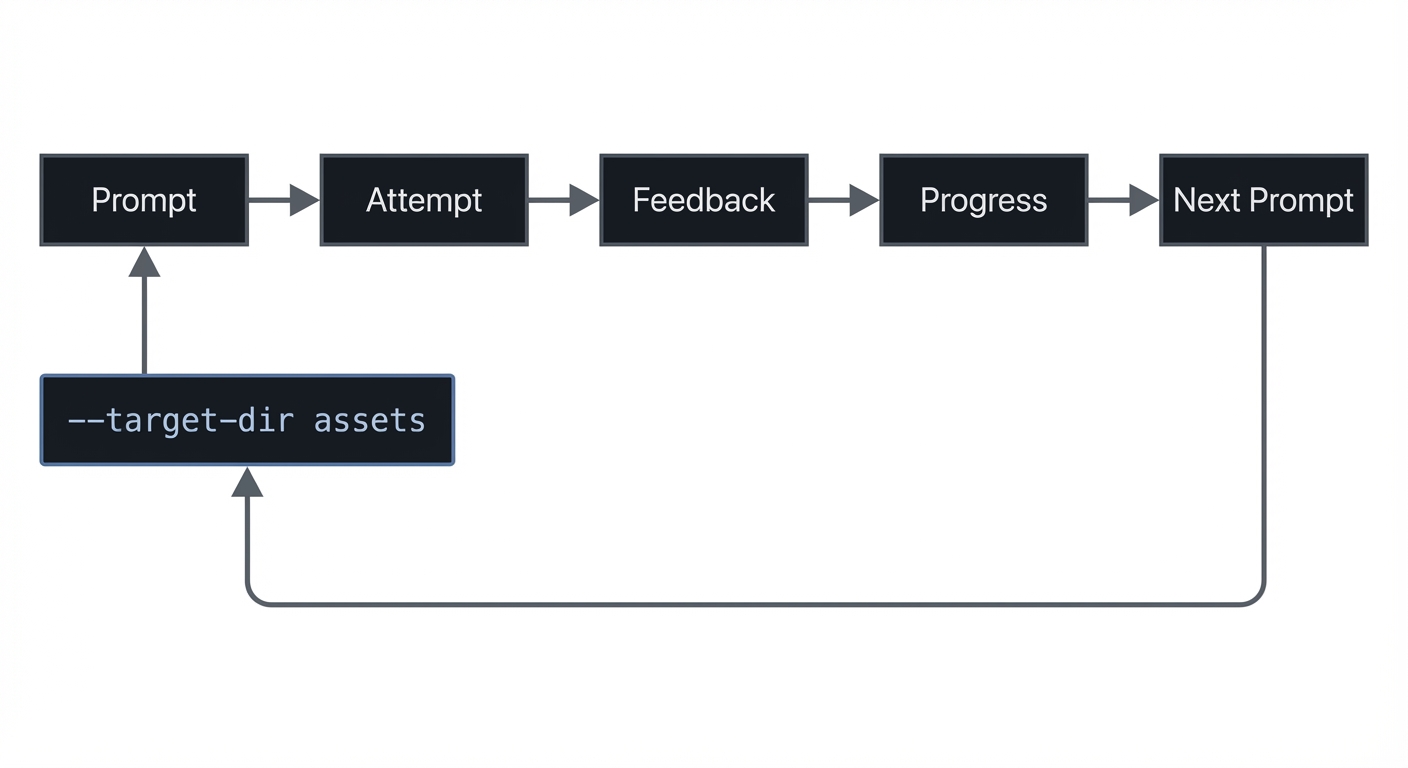
Kids learn through repetition, play, and immediate feedback. A good educational app is not just a collection of exercises. It is an experience that guides the child through small successes, builds confidence, and gradually raises difficulty. The simplest way to think about this is “prompt, attempt, feedback, progress.” Each loop should be short and clear. The child should always understand what to do next and feel rewarded for effort.
Accessibility is not optional. Kids include a wide range of abilities, including motor, visual, and cognitive differences. iOS provides built-in accessibility features, but your app must support them: large tap targets, clear contrast, voice prompts, and consistent layouts. When you use system components and standard text styles, you get much of this for free. When you use custom visuals or animations, you must rebuild those affordances yourself.
The design should minimize text. Younger children cannot read long instructions. Use icons, audio cues, and visual demonstrations. If you must use text, keep it short and pair it with a voice prompt.
Finally, avoid manipulative engagement loops. Kids apps should be supportive, not addictive. Avoid time pressure, intrusive notifications, or reward structures that push children to keep playing beyond healthy limits. Parents should feel safe letting their child use the app.
Deep Dive
Learning design starts with choosing the skill. For example: letter recognition, phonics, simple counting, emotional labeling, or spatial reasoning. Each skill has a target age range and a progression from easy to harder tasks. For instance, letter recognition might start with matching a letter shape, then move to identifying the sound, then to picking the correct letter in a word. The app must scaffold this progression.
A strong learning loop has three characteristics: 1) Clear prompt: the child knows what to do without reading a paragraph. 2) Immediate feedback: the app responds instantly and clearly to correct and incorrect answers. 3) Meaningful progress: the child feels advancement, such as unlocking a new level or earning a new sticker.
Feedback should be multi-sensory. A correct answer can trigger a pleasant sound, a short animation, and a visual reward. Incorrect answers should be gentle and supportive, not punitive. The objective is to keep the child engaged while reducing anxiety.
Pacing matters. Young children have short attention spans, so each interaction should be small. This is why micro-level design (tap targets, audio timing, animation length) is just as important as macro-level design (levels, themes, story arcs).
You should also design for choice and autonomy. Kids like to explore. Providing a “safe sandbox” where they can tap and discover without failure can increase curiosity. However, too much freedom without guidance can create confusion, so balance exploration with clear pathways.
Accessibility extends beyond disability; it includes age-appropriate interaction. Tap targets should be large, spacing should prevent accidental taps, and gestures should be simple (tap, drag, swipe). Avoid complex multi-touch gestures unless the age group is older and you introduce them gradually.
Progress tracking is important for parents. It can be as simple as a progress bar or a set of badges. But be careful: progress data should not require a child to create an account or reveal any personal information. A good approach is a local “parent dashboard” behind a gate that summarizes progress in a simple, visual form.
Finally, consider the content pipeline. A kids app is only as good as its content. Plan how you will create and update word lists, audio clips, and visual assets. Use consistent style and voice. Avoid mismatched characters or tone shifts. Content consistency is a major trust factor for parents and a cognitive anchor for children.
Definitions and Key Terms
- Learning Loop: The repeated cycle of prompt, attempt, feedback, and reward.
- Scaffolding: Gradually increasing difficulty while supporting the learner.
- Multi-Sensory Feedback: Combining visual, audio, and haptic responses.
- Tap Target: The on-screen area a user can tap; must be large for kids.
- Safe Sandbox: A space where exploration is encouraged without penalties.
Mental Model Diagram
Learning loop in a kids app:
Prompt -> Attempt -> Feedback -> Progress -> Next Prompt
  ^                                          |
  |------------------------------------------|
 Feedback channels:
- Visual (stars, colors)
- Audio (cheer, voice prompt)
- Haptic (gentle tap)
How It Works (Step-by-Step)
- Pick a target skill and define success criteria.
- Break the skill into small steps and design tasks for each.
- For each task, design a short loop: prompt, attempt, feedback, reward.
- Add scaffolding: start easy, add complexity over time.
- Provide a parent-facing progress view behind a gate.
- Test with real children and note where confusion occurs.
Invariants:
- The child always knows what to do next.
- Feedback is immediate and supportive.
- The experience works with minimal text.
Failure modes:
- The child does not understand instructions.
- Feedback is delayed or confusing.
- Rewards feel arbitrary or distracting.
Minimal Concrete Example (Pseudocode)
Adaptive difficulty logic:
IF child answers 3 in a row correctly increase difficulty one level ELSE IF child misses 2 in a row reduce difficulty and replay hint
Parent dashboard summary:
SHOW total activities completed SHOW skill areas mastered SHOW “next recommended” activity
Common Misconceptions
- “Kids want lots of flashing animations.” False: too much stimulation reduces focus.
- “Text instructions are enough.” False: pre-literate kids need audio or visual guidance.
- “Rewards are only for motivation.” False: rewards also signal that progress is real.
Check-Your-Understanding Questions
- Why is scaffolding important for educational apps?
- What makes feedback “supportive” instead of punitive?
- Why should progress tracking avoid personal identifiers?
Check-Your-Understanding Answers
- It prevents frustration by matching task difficulty to the child’s current ability.
- It guides the child to try again without shaming or negative signals.
- It reduces privacy risk and avoids unnecessary data collection.
Real-World Applications
- Letter-sound games that gradually increase speed.
- Counting apps that shift from objects to numbers.
- Emotional learning apps with visual mood cards.
Where You Will Apply It
Projects 1-10, especially Projects 1, 2, 4, 5, 7, and 9.
References
- Apple Human Interface Guidelines (accessibility and interaction basics)
- Apple Accessibility resources
- Educational game design research (general pedagogy and feedback loops)
Key Insight
Great kids apps are learning environments disguised as play, with feedback that builds confidence.
Summary
Learning design is the core of kids apps. By focusing on short, supportive loops and multi-sensory feedback, you create experiences that are both fun and effective.
Homework / Exercises
- Create a 5-step scaffolding plan for a math skill (e.g., counting to 10).
- Sketch two feedback animations: one for success, one for gentle retry.
- Write a single-sentence voice prompt for a pre-literate child.
Solutions to the Homework / Exercises
- Start with 1-3 objects, then 1-5, then 1-10, then simple addition with objects, then number-only problems.
- Success: stars burst with a cheerful sound. Retry: soft wobble with a friendly “try again” sound.
- “Find the blue circle.” (paired with a glowing blue circle).
Glossary
- COPPA: U.S. law protecting children under 13 in online services.
- Kids Category: App Store designation for apps for ages 11 and under.
- Parental Gate: An adult-only challenge blocking purchases or external links.
- Privacy Nutrition Label: App Store disclosure of data collection and use.
- Scaffolding: Gradual progression in difficulty for learning tasks.
- Learning Loop: Prompt, attempt, feedback, progress.
- Offline-First: Core experience works with no network.
Why Kids iPhone Apps Matter
- Modern motivation: Parents want safe, high-quality learning tools and small games without ads or tracking.
- Platform impact: The App Store Kids Category requires explicit age bands (5 and under, 6-8, 9-11) and strict restrictions on data collection and external links (Apple Kids Category docs, 2025).
- Privacy and compliance: COPPA covers children under 13 and requires parental consent before collecting personal information. The FTC finalized updates to COPPA in January 2025, expanding definitions of personal information and strengthening opt-in requirements for targeted advertising (FTC, 2025).
- App Store evolution: Apple has announced updated age rating questions that developers must answer by January 31, 2026 to continue submitting apps (App Store Connect News, 2025).
Old vs new approach:
OLD (general audience first): +——-+ +————–+ +——–+ +——————–+ | Build | -> | Add analytics| -> | Add ads| -> | Worry about privacy | +——-+ +————–+ +——–+ +——————–+
NEW (kids-first): +——–+ +————–+ +—————-+ +——-+ +——+ | Safety | -> | Minimize data| -> | Parental gates | -> | Trust | -> | Ship | +——–+ +————–+ +—————-+ +——-+ +——+
Concept Summary Table
| Concept Cluster | What You Need to Internalize |
|---|---|
| Kid-Safe Compliance | Kids Category rules, COPPA, parental gates, data minimization, privacy disclosures. |
| iOS Architecture | State-driven UI, offline-first storage, asset pipelines, predictable app states. |
| Learning Experience Design | Short learning loops, scaffolding, supportive feedback, accessibility for kids. |
Project-to-Concept Map
| Project | Concepts Applied |
|---|---|
| 1. Alphabet Flashcards | Learning Experience, iOS Architecture |
| 2. Color and Shape Sorter | Learning Experience, iOS Architecture |
| 3. Read-Aloud Storybook | Learning Experience, Compliance |
| 4. Counting Adventure | Learning Experience, iOS Architecture |
| 5. Memory Match Game | Learning Experience, iOS Architecture |
| 6. Chore Tracker with Parent Zone | Compliance, iOS Architecture |
| 7. Sight Words Bingo | Learning Experience, iOS Architecture |
| 8. Science Explorer Mini-Lab | Learning Experience, iOS Architecture |
| 9. Emotion Check-In Journal | Learning Experience, Compliance |
| 10. Kids Learning Hub (Capstone) | Compliance, iOS Architecture, Learning Experience |
Deep Dive Reading by Concept
| Concept | Book and Chapter | Why This Matters |
|---|---|---|
| iOS App Architecture | “Clean Architecture” by Robert C. Martin - Ch. 1-4 | Teaches clean boundaries between UI and logic. |
| State and Simplicity | “Clean Code” by Robert C. Martin - Ch. 2-4 | Improves clarity and maintainability. |
| Patterns for UI Flows | “Head First Design Patterns” by Eric Freeman and Elisabeth Robson - Ch. 1-3 | Helps model state and transitions. |
| Product Design Thinking | “Design It!” by Michael Keeling - Ch. 1-3 | Frames UX decisions as design tradeoffs. |
Quick Start: Your First 48 Hours
Day 1:
- Read Chapter 1 (Compliance) and Chapter 2 (Architecture).
- Start Project 1 and get the first flashcard screen and audio prompt working.
Day 2:
- Validate Project 1 against the Definition of Done.
- Read the “Core Question” and “Pitfalls” sections for Project 2.
Recommended Learning Paths
Path 1: The Beginner Parent-Builder
- Project 1 -> Project 2 -> Project 3 -> Project 6
Path 2: The Game-Focused Builder
- Project 2 -> Project 4 -> Project 5 -> Project 7 -> Project 10
Path 3: The Compliance-First Builder
- Project 3 -> Project 6 -> Project 9 -> Project 10
Success Metrics
- You can design a kids app that passes App Store review with no privacy issues.
- You can build an offline-first learning app with consistent progress tracking.
- You can explain how a learning loop and a state machine drive the user experience.
Appendix: Kids App Compliance Checklist
- Parental gate protects external links, purchases, and settings
- No third-party tracking SDKs or ad networks
- Privacy disclosure matches actual data behavior
- App uses age-appropriate language and visuals
- No user-generated content or open chat
Appendix: Parental Gate Patterns
- Two-corner press-and-hold (5 seconds)
- Simple adult math question with voice prompt
- “Read this word” gate for older kids apps
Project List
The following projects guide you from basic kid-friendly UI and feedback loops to a full learning hub with parental controls and compliance-ready design.
- Alphabet Flashcards (Audio + Visual)
- Color and Shape Sorter (Drag and Drop)
- Read-Aloud Storybook (Pages + Audio)
- Counting Adventure (Mini Game Loop)
- Memory Match Game (Cards and Patterns)
- Chore Tracker with Parent Zone
- Sight Words Bingo
- Science Explorer Mini-Lab
- Emotion Check-In Journal (Local Only)
- Kids Learning Hub (Capstone)
## Project 1: Alphabet Flashcards (Audio + Visual)
- File: P01_ALPHABET_FLASHCARDS.md
- Main Programming Language: Swift
- Alternative Programming Languages: Objective-C, C# (Unity), JavaScript (React Native)
- Coolness Level: Level 2 (Practical but Forgettable)
- Business Potential: Level 2 (Micro-SaaS / Pro Tool)
- Difficulty: Level 1 (Beginner)
- Knowledge Area: UX, Audio, State Management
- Software or Tool: SwiftUI, AVFoundation
- Main Book: “Clean Code” by Robert C. Martin
What you will build: A kid-friendly flashcard app that shows a letter with a matching object and plays the letter sound.
Why it teaches kids app design: It forces you to build a simple learning loop with immediate audio feedback and large tap targets.
Core challenges you will face:
- Simple state flow -> iOS Architecture
- Audio timing -> Learning Experience Design
- Large, readable UI -> Learning Experience Design
Real World Outcome
A full-screen flashcard experience:
- A giant uppercase letter centered on screen.
- A single friendly illustration (A for Apple).
- A large “Play Sound” button and an optional “Next” button.
- When tapped, the app plays a clean audio pronunciation and briefly animates the letter.
- The app cycles through a curated set of 26 cards with consistent spacing and colors.
The Core Question You Are Answering
“How do I design a learning loop that feels instant and understandable to a pre-literate child?”
The answer teaches you how to make state changes visible, audible, and predictable.
Concepts You Must Understand First
- State-driven UI
- How does the UI change when the current card changes?
- Book Reference: “Clean Code” by Robert C. Martin - Ch. 2
- Feedback design
- What makes audio feedback feel supportive rather than distracting?
- Book Reference: “Design It!” by Michael Keeling - Ch. 1
Questions to Guide Your Design
- Learning Loop
- How short should a single card interaction be?
- How do you signal “correct” when there is no wrong answer?
- Accessibility
- How large should your tap targets be?
- How will voice prompts work if the device is muted?
Thinking Exercise
Instant Feedback Map
Draw the timeline of a child tapping “Play Sound” and note when each feedback element triggers.
Questions to answer:
- Where could a delay confuse the child?
- What is the minimum feedback needed for the action to feel complete?
The Interview Questions They Will Ask
- “How does a declarative UI help you create immediate feedback?”
- “What is the simplest state model for a flashcard app?”
- “How do you keep audio assets organized?”
- “Why should kids apps avoid small tap targets?”
- “How would you test audio timing without real children present?”
Hints in Layers
Hint 1: Starting Point Model the app as a single current card index and update it on tap.
Hint 2: Next Level Preload audio files and cache them to avoid delay.
Hint 3: Technical Details Use a small state object: currentIndex -> card -> image + sound.
Hint 4: Tools/Debugging Log state changes when a tap occurs and verify the audio file exists for each card.
Books That Will Help
| Topic | Book | Chapter |
|---|---|---|
| Simplicity and clarity | “Clean Code” by Robert C. Martin | Ch. 2-3 |
Common Pitfalls and Debugging
Problem 1: “Audio plays late or not at all”
- Why: Audio not preloaded or file path mismatch.
- Fix: Preload assets at startup and verify file names.
- Quick test: Tap through all letters and confirm each sound plays within 200ms.
Definition of Done
- Each letter displays with a matching image
- Audio plays within 200ms of tap
- Tap targets are large and accessible
- No external links or data collection
## Project 2: Color and Shape Sorter (Drag and Drop)
- File: P02_COLOR_SHAPE_SORTER.md
- Main Programming Language: Swift
- Alternative Programming Languages: Objective-C, C# (Unity), JavaScript (React Native)
- Coolness Level: Level 3 (Genuinely Clever)
- Business Potential: Level 2 (Micro-SaaS / Pro Tool)
- Difficulty: Level 2 (Intermediate)
- Knowledge Area: Gestures, State Management, Feedback Loops
- Software or Tool: SwiftUI gestures
- Main Book: “Head First Design Patterns” by Eric Freeman and Elisabeth Robson
What you will build: A drag-and-drop sorting game where kids match shapes to colored bins.
Why it teaches kids app design: It introduces gestures, error feedback, and supportive retries.
Core challenges you will face:
- Drag-and-drop interactions -> Learning Experience Design
- State transitions (success/fail) -> iOS Architecture
- Gentle error feedback -> Learning Experience Design
Real World Outcome
A game screen with 3 big bins at the bottom (red, blue, yellow) and floating shapes at the top. The child drags each shape into the correct bin. Correct drops trigger a sparkle animation and a happy sound. Incorrect drops gently bounce back with a “try again” sound.
The Core Question You Are Answering
“How can I let children make mistakes without frustration?”
You learn to design failure states that are safe and encouraging.
Concepts You Must Understand First
- Gesture handling
- How do you track drag position and detect drop zones?
- Book Reference: “Head First Design Patterns” by Eric Freeman and Elisabeth Robson - Ch. 1
- Supportive feedback
- What makes a failure feel gentle instead of punitive?
- Book Reference: “Design It!” by Michael Keeling - Ch. 2
Questions to Guide Your Design
- Interaction Design
- How much snap should a shape have when near the correct bin?
- How do you prevent accidental drops?
- Feedback Timing
- How quickly should the app respond to a drop?
- Should incorrect drops produce visual or audio feedback first?
Thinking Exercise
Drop Zone Precision
Sketch the bin and define the invisible hit area around it. Decide how forgiving the target should be.
Questions to answer:
- What is the minimum tolerance that still feels fair?
- How does tolerance change with age range?
The Interview Questions They Will Ask
- “Why should kids interfaces be more forgiving than adult interfaces?”
- “How do you implement a state machine for drag-and-drop?”
- “What is the best way to signal a correct match?”
- “How do you avoid accidental drags?”
- “How would you test for gesture bugs?”
Hints in Layers
Hint 1: Starting Point Track the current dragged item and its position on screen.
Hint 2: Next Level Define bin hit areas that are larger than the visible bins.
Hint 3: Technical Details On drop, evaluate distance to nearest bin; if within threshold, snap to bin and celebrate.
Hint 4: Tools/Debugging Visualize hit areas by temporarily drawing outlines during debugging.
Books That Will Help
| Topic | Book | Chapter |
|---|---|---|
| Patterns for interactions | “Head First Design Patterns” by Eric Freeman and Elisabeth Robson | Ch. 1-2 |
Common Pitfalls and Debugging
Problem 1: “Shapes feel hard to drop”
- Why: Hit area too small or drop detection too strict.
- Fix: Increase hit area, snap earlier, and smooth animations.
- Quick test: Observe a child; if they miss 2 drops in a row, widen the target.
Definition of Done
- Shapes snap into correct bins with positive feedback
- Incorrect drops gently reset without penalty
- Tap targets are large and forgiving
- All content works offline
## Project 3: Read-Aloud Storybook (Pages + Audio)
- File: P03_READ_ALOUD_STORYBOOK.md
- Main Programming Language: Swift
- Alternative Programming Languages: Objective-C, C# (Unity), JavaScript (React Native)
- Coolness Level: Level 3 (Genuinely Clever)
- Business Potential: Level 2 (Micro-SaaS / Pro Tool)
- Difficulty: Level 2 (Intermediate)
- Knowledge Area: Media, UI Flow, Compliance
- Software or Tool: SwiftUI, AVFoundation
- Main Book: “Design It!” by Michael Keeling
What you will build: A storybook app with page swipes, highlighted text, and synchronized narration audio.
Why it teaches kids app design: It teaches pacing, audio synchronization, and parental gate design for external links.
Core challenges you will face:
- Audio sync with text -> Learning Experience Design
- Page state management -> iOS Architecture
- Parental gate for links -> Compliance
Real World Outcome
A storybook with 8 pages:
- Each page shows a full illustration and 2-3 lines of text.
- A “Read to Me” button plays narration and highlights text as it is spoken.
- The last page includes a “More Stories” button that is protected by a parental gate.
The Core Question You Are Answering
“How do I combine narration, text, and visuals into a single smooth learning experience?”
This teaches timing, pacing, and parent-safe navigation.
Concepts You Must Understand First
- Media timing
- How do you keep narration and text highlights in sync?
- Book Reference: “Clean Code” by Robert C. Martin - Ch. 4
- Parental gate design
- Where should the gate appear and how should it look?
- Book Reference: “Design It!” by Michael Keeling - Ch. 1
Questions to Guide Your Design
- Page Flow
- How will you represent the current page and its assets?
- How do you prevent accidental page skips?
- Audio Experience
- Should narration start automatically or on tap?
- How do you handle pause and replay?
Thinking Exercise
Narration Timeline
Map out a single page: where the voice starts, which words highlight, and when the page ends.
Questions to answer:
- How would a child replay a word they did not understand?
- What if the child swipes mid-narration?
The Interview Questions They Will Ask
- “How would you sync text highlights to narration?”
- “How do you design a parental gate that is not frustrating?”
- “How do you store story assets efficiently?”
- “What is the tradeoff between auto-play and tap-to-play narration?”
- “How would you test narration timing?”
Hints in Layers
Hint 1: Starting Point Model each page as a data object with text, image, and audio.
Hint 2: Next Level Use a timing map to highlight text segments during playback.
Hint 3: Technical Details Maintain a playback state: idle -> playing -> paused; update highlights based on timestamp.
Hint 4: Tools/Debugging Add a developer overlay showing narration timestamp and current highlighted word.
Books That Will Help
| Topic | Book | Chapter |
|---|---|---|
| UI flow clarity | “Design It!” by Michael Keeling | Ch. 1-2 |
Common Pitfalls and Debugging
Problem 1: “Highlight timing drifts”
- Why: Audio timestamps are not aligned with text segments.
- Fix: Adjust timing map and test with real audio files.
- Quick test: Play narration and verify each line highlights correctly.
Definition of Done
- All pages load smoothly with images and text
- Narration highlights text at the right times
- Parental gate blocks external link access
- Works fully offline
## Project 4: Counting Adventure (Mini Game Loop)
- File: P04_COUNTING_ADVENTURE.md
- Main Programming Language: Swift
- Alternative Programming Languages: Objective-C, C# (Unity), JavaScript (React Native)
- Coolness Level: Level 3 (Genuinely Clever)
- Business Potential: Level 2 (Micro-SaaS / Pro Tool)
- Difficulty: Level 2 (Intermediate)
- Knowledge Area: Game Loop, Feedback, State
- Software or Tool: SwiftUI, Core Haptics
- Main Book: “Design It!” by Michael Keeling
What you will build: A counting game where children tap a set of objects and then choose the correct number.
Why it teaches kids app design: It combines a learning loop with immediate feedback and adaptive difficulty.
Core challenges you will face:
- Loop pacing -> Learning Experience Design
- State transitions -> iOS Architecture
- Positive reinforcement -> Learning Experience Design
Real World Outcome
A playful screen with 5-10 animated objects (stars, apples). The child taps each object to count them, then selects the correct number from 3 large options. Correct answers trigger a brief animation and a gentle vibration; incorrect answers offer a hint and a retry.
The Core Question You Are Answering
“How do I build a learning loop that adapts to a child’s pace without breaking flow?”
Concepts You Must Understand First
- Adaptive difficulty
- How do you adjust challenge without making it feel punitive?
- Book Reference: “Design It!” by Michael Keeling - Ch. 3
- State-driven loops
- How do you reset the scene for the next round?
- Book Reference: “Clean Code” by Robert C. Martin - Ch. 2
Questions to Guide Your Design
- Pacing
- How long should celebration animations be?
- When should hints appear?
- UI Clarity
- Are the number choices large and spaced enough?
- How do you prevent accidental double taps?
Thinking Exercise
Loop Timing
Draw a 10-second timeline for a full round. Mark where feedback occurs.
Questions to answer:
- Where might a child lose attention?
- How can you shorten the loop without losing learning value?
The Interview Questions They Will Ask
- “How do you decide when to increase difficulty?”
- “Why is immediate feedback critical for kids?”
- “How do you prevent a child from racing through without learning?”
- “How would you log learning progress without collecting personal data?”
- “What is the simplest state model for a counting game?”
Hints in Layers
Hint 1: Starting Point Track a current target number and a list of objects.
Hint 2: Next Level Use a score streak to adapt difficulty up or down.
Hint 3: Technical Details After each round, rebuild the object list and reset selection state.
Hint 4: Tools/Debugging Add a debug overlay showing current difficulty and streak.
Books That Will Help
| Topic | Book | Chapter |
|---|---|---|
| Adaptive product design | “Design It!” by Michael Keeling | Ch. 3 |
Common Pitfalls and Debugging
Problem 1: “Kids tap too fast and skip feedback”
- Why: Input is not throttled during animations.
- Fix: Temporarily disable input during feedback animations.
- Quick test: Try to spam taps and verify that feedback still plays fully.
Definition of Done
- Counting loop works with correct and incorrect flows
- Difficulty adapts based on streaks
- Feedback is immediate and supportive
- Works offline with no data collection
## Project 5: Memory Match Game (Cards and Patterns)
- File: P05_MEMORY_MATCH.md
- Main Programming Language: Swift
- Alternative Programming Languages: Objective-C, C# (Unity), JavaScript (React Native)
- Coolness Level: Level 3 (Genuinely Clever)
- Business Potential: Level 2 (Micro-SaaS / Pro Tool)
- Difficulty: Level 2 (Intermediate)
- Knowledge Area: State Machines, Game Logic
- Software or Tool: SwiftUI, animations
- Main Book: “Head First Design Patterns” by Eric Freeman and Elisabeth Robson
What you will build: A memory match game with 8-16 cards and gentle time-based hints.
Why it teaches kids app design: It requires clear state transitions and gentle error handling.
Core challenges you will face:
- State machine modeling -> iOS Architecture
- Feedback timing -> Learning Experience Design
- Progress tracking -> iOS Architecture
Real World Outcome
A grid of large, friendly cards that flip to reveal images. The child taps two cards. If they match, they stay revealed with a celebration sound. If they do not match, they gently flip back with a soft “try again” cue. A progress bar shows how many matches remain.
The Core Question You Are Answering
“How do I structure a game loop so errors feel safe and progress feels rewarding?”
Concepts You Must Understand First
- State machine design
- How many states are needed for a two-card selection flow?
- Book Reference: “Head First Design Patterns” by Eric Freeman and Elisabeth Robson - Ch. 1
- Pacing and hints
- When should hints appear and how strong should they be?
- Book Reference: “Design It!” by Michael Keeling - Ch. 2
Questions to Guide Your Design
- Game Flow
- How do you prevent tapping a third card during evaluation?
- How do you reset the board between rounds?
- Feedback
- How long should the cards stay open before flipping back?
- How do you celebrate the final match?
Thinking Exercise
State Machine Sketch
Draw the states: no selection, one selected, two selected (match), two selected (no match), round complete.
Questions to answer:
- Which transitions need timers?
- Where should user input be disabled?
The Interview Questions They Will Ask
- “Why is a state machine useful for a memory game?”
- “How do you prevent race conditions in tap handling?”
- “How do you keep the game fair for younger kids?”
- “How do you test deterministic outcomes in a game?”
- “What are the tradeoffs between more cards and longer sessions?”
Hints in Layers
Hint 1: Starting Point Track selected indices and match state.
Hint 2: Next Level Disable taps while evaluating a pair.
Hint 3: Technical Details Use a timer to delay flip-back, then reset selected state.
Hint 4: Tools/Debugging Log state transitions and verify they follow the expected sequence.
Books That Will Help
| Topic | Book | Chapter |
|---|---|---|
| State modeling | “Head First Design Patterns” by Eric Freeman and Elisabeth Robson | Ch. 1 |
Common Pitfalls and Debugging
Problem 1: “Cards can be tapped while flipping”
- Why: Input is not blocked during animation.
- Fix: Disable input during flip animations and evaluation.
- Quick test: Rapidly tap three cards; only two should ever flip.
Definition of Done
- Matching logic works with no race conditions
- Feedback is clear for match and no-match
- Progress shows remaining pairs
- Works offline and saves progress locally
## Project 6: Chore Tracker with Parent Zone
- File: P06_CHORE_TRACKER_PARENT_ZONE.md
- Main Programming Language: Swift
- Alternative Programming Languages: Objective-C, JavaScript (React Native), C# (Unity)
- Coolness Level: Level 2 (Practical but Forgettable)
- Business Potential: Level 2 (Micro-SaaS / Pro Tool)
- Difficulty: Level 2 (Intermediate)
- Knowledge Area: Compliance, Local Storage, UX
- Software or Tool: SwiftUI, local storage
- Main Book: “Clean Architecture” by Robert C. Martin
What you will build: A local-only chore tracker for kids with a gated parent dashboard.
Why it teaches kids app design: It forces you to build parental gates, progress tracking, and privacy-safe profiles.
Core challenges you will face:
- Parental gate -> Compliance
- Local data persistence -> iOS Architecture
- Simple progress UI -> Learning Experience Design
Real World Outcome
A colorful list of chores with big icons. The child can tap to mark a chore done and earn a sticker. A “Parent Zone” button in the corner opens a gate. Inside the parent zone, there is a weekly progress summary, ability to add or remove chores, and a reset button.
The Core Question You Are Answering
“How do I give parents control while keeping the child experience simple and safe?”
Concepts You Must Understand First
- Local persistence
- How do you store completed tasks without creating accounts?
- Book Reference: “Clean Architecture” by Robert C. Martin - Ch. 1
- Parental gate UX
- How do you hide settings from children without feeling punitive?
- Book Reference: “Design It!” by Michael Keeling - Ch. 2
Questions to Guide Your Design
- Parent Dashboard
- What should a parent see in 10 seconds?
- How can you summarize progress without charts that are too complex?
- Child Experience
- How do you make checkmarks feel rewarding?
- How do you prevent accidental resets?
Thinking Exercise
Parent Zone Map
Sketch the parent dashboard screen and list every action that should be locked behind the gate.
Questions to answer:
- What is the simplest possible parent view?
- How do you prevent a child from discovering the gate pattern?
The Interview Questions They Will Ask
- “How do you implement a parental gate in a child-safe way?”
- “Why is local-only storage important for privacy?”
- “How would you handle multiple child profiles without names?”
- “What is the risk of having settings in the main navigation?”
- “How do you design for parent trust?”
Hints in Layers
Hint 1: Starting Point Separate child view and parent view as two distinct screens.
Hint 2: Next Level Use a simple on-device data store keyed by anonymous profiles.
Hint 3: Technical Details Add a gate challenge that must be solved before entering the parent zone.
Hint 4: Tools/Debugging Log entry attempts to ensure the gate always triggers.
Books That Will Help
| Topic | Book | Chapter |
|---|---|---|
| Data boundaries | “Clean Architecture” by Robert C. Martin | Ch. 1-2 |
Common Pitfalls and Debugging
Problem 1: “Child can access settings”
- Why: Parent zone entry is not gated on every path.
- Fix: Centralize the gate and ensure all parent routes pass through it.
- Quick test: Try to open parent settings from every entry point.
Definition of Done
- Child view is clean and uncluttered
- Parent zone is gated and accessible in under 10 seconds
- Progress is stored locally with no personal data
- Reset functions are protected
## Project 7: Sight Words Bingo
- File: P07_SIGHT_WORDS_BINGO.md
- Main Programming Language: Swift
- Alternative Programming Languages: Objective-C, C# (Unity), JavaScript (React Native)
- Coolness Level: Level 3 (Genuinely Clever)
- Business Potential: Level 2 (Micro-SaaS / Pro Tool)
- Difficulty: Level 2 (Intermediate)
- Knowledge Area: Randomization, Audio, UX
- Software or Tool: SwiftUI, AVFoundation
- Main Book: “Clean Code” by Robert C. Martin
What you will build: A bingo-style sight words game with spoken prompts and a randomized grid.
Why it teaches kids app design: It teaches randomization, repeatable difficulty, and clear audio prompts.
Core challenges you will face:
- Prompt clarity -> Learning Experience Design
- Stateful grid -> iOS Architecture
- Replayable sessions -> iOS Architecture
Real World Outcome
A 4x4 grid of large tiles each containing a sight word. The app speaks a target word aloud. The child taps the matching tile. A correct tap highlights the tile and adds a star. After 5 correct taps, a “Bingo” celebration plays. A “Repeat word” button replays the prompt.
The Core Question You Are Answering
“How do I design a repeatable learning game that stays fair and engaging?”
Concepts You Must Understand First
- Randomization with control
- How do you keep randomness fair and predictable?
- Book Reference: “Clean Code” by Robert C. Martin - Ch. 2
- Audio prompts
- How do you make spoken prompts clear and consistent?
- Book Reference: “Design It!” by Michael Keeling - Ch. 2
Questions to Guide Your Design
- Grid Design
- How many words should appear at once for each age group?
- How will you highlight a correct tile?
- Replayability
- How will you ensure the same word is not repeated too soon?
- How do you allow a parent to change the word list?
Thinking Exercise
Fair Randomness
Design a randomization rule that ensures every word appears before repeats.
Questions to answer:
- What happens if the child taps the wrong word repeatedly?
- How should the system respond to frustration?
The Interview Questions They Will Ask
- “How do you prevent randomness from becoming unfair?”
- “How do you handle repeated incorrect taps?”
- “Why is a repeat prompt button important?”
- “How do you design for multiple age ranges?”
- “How would you store custom word lists locally?”
Hints in Layers
Hint 1: Starting Point Create a list of words and shuffle it for the grid.
Hint 2: Next Level Track which words have been used and cycle through them before repeats.
Hint 3: Technical Details Use a queue of words for prompts and reset when empty.
Hint 4: Tools/Debugging Log the word order and verify no repeats until the list is exhausted.
Books That Will Help
| Topic | Book | Chapter |
|---|---|---|
| Clarity and simplicity | “Clean Code” by Robert C. Martin | Ch. 2 |
Common Pitfalls and Debugging
Problem 1: “The same word repeats too often”
- Why: Random selection without tracking history.
- Fix: Use a shuffle-and-consume list.
- Quick test: Simulate 20 prompts and check for repeats before full coverage.
Definition of Done
- Grid displays large, readable words
- Audio prompt is clear and replayable
- Randomization is fair and repeatable
- Works offline
## Project 8: Science Explorer Mini-Lab
- File: P08_SCIENCE_EXPLORER.md
- Main Programming Language: Swift
- Alternative Programming Languages: Objective-C, C# (Unity), JavaScript (React Native)
- Coolness Level: Level 4 (Hardcore Tech Flex)
- Business Potential: Level 2 (Micro-SaaS / Pro Tool)
- Difficulty: Level 3 (Advanced)
- Knowledge Area: Simulation, Interaction Design
- Software or Tool: SwiftUI, SpriteKit
- Main Book: “Design It!” by Michael Keeling
What you will build: A mini-lab with 3 simple simulations (e.g., mixing colors, gravity, and magnets).
Why it teaches kids app design: It teaches interactive exploration, safe experimentation, and visual feedback.
Core challenges you will face:
- Interactive simulation -> Learning Experience Design
- Performance and assets -> iOS Architecture
- Exploratory UX -> Learning Experience Design
Real World Outcome
A “lab” screen with three experiments. Example: the color mixer lets kids drag droplets of red, blue, and yellow into a circle to mix colors. The gravity experiment lets kids drop balls to see bounce physics. Each experiment has a “reset” button and a short audio explanation.
The Core Question You Are Answering
“How do I create a safe sandbox where kids can explore and still learn a concept?”
Concepts You Must Understand First
- Exploratory learning
- How do you guide exploration without over-instructing?
- Book Reference: “Design It!” by Michael Keeling - Ch. 3
- Performance awareness
- How do you keep animations smooth on older devices?
- Book Reference: “Clean Architecture” by Robert C. Martin - Ch. 2
Questions to Guide Your Design
- Simulation Limits
- What behaviors will you simulate and which will you fake?
- How do you prevent too many objects on screen?
- Learning Signals
- How does the child know what concept they learned?
- What short summary appears at the end of an experiment?
Thinking Exercise
Sandbox Boundaries
Define the rules for the color mixing experiment. Decide what happens if a child mixes more than 3 colors.
Questions to answer:
- How do you keep the simulation from becoming chaotic?
- How do you reset without losing the sense of progress?
The Interview Questions They Will Ask
- “How do you design exploration without confusing the user?”
- “What performance strategies keep animations smooth?”
- “How do you decide when to simulate vs approximate?”
- “How do you explain a concept after an open-ended activity?”
- “How would you test this with children?”
Hints in Layers
Hint 1: Starting Point Limit each experiment to 2-3 interactive objects.
Hint 2: Next Level Use simplified physics rules to keep behavior predictable.
Hint 3: Technical Details Throttle object creation and reuse objects when possible.
Hint 4: Tools/Debugging Add a debug overlay showing object count and frame rate.
Books That Will Help
| Topic | Book | Chapter |
|---|---|---|
| Product design constraints | “Design It!” by Michael Keeling | Ch. 3 |
Common Pitfalls and Debugging
Problem 1: “Animations stutter”
- Why: Too many objects or heavy assets.
- Fix: Limit objects, compress assets, reduce effects.
- Quick test: Stress test by adding 20 objects and measure frame drops.
Definition of Done
- Three experiments work smoothly
- Each experiment teaches one clear concept
- Reset and guidance are easy to find
- Works offline
## Project 9: Emotion Check-In Journal (Local Only)
- File: P09_EMOTION_CHECKIN.md
- Main Programming Language: Swift
- Alternative Programming Languages: Objective-C, JavaScript (React Native), C# (Unity)
- Coolness Level: Level 2 (Practical but Forgettable)
- Business Potential: Level 2 (Micro-SaaS / Pro Tool)
- Difficulty: Level 2 (Intermediate)
- Knowledge Area: UX, Privacy, Local Storage
- Software or Tool: SwiftUI, local storage
- Main Book: “Clean Architecture” by Robert C. Martin
What you will build: A simple mood journal where kids tap an emotion icon and record a short reflection with stickers or drawings.
Why it teaches kids app design: It reinforces privacy-first storage and gentle UX for emotional content.
Core challenges you will face:
- Privacy and data minimization -> Compliance
- Supportive UX -> Learning Experience Design
- Local-only storage -> iOS Architecture
Real World Outcome
A daily check-in screen with 5 large emotion icons (happy, sad, excited, angry, calm). The child taps one, then selects stickers or colors to decorate a journal page. A parent zone shows a weekly summary without storing names or personal text.
The Core Question You Are Answering
“How do I let kids express emotions while keeping data private and safe?”
Concepts You Must Understand First
- Privacy-first design
- What data is necessary vs optional?
- Book Reference: “Clean Architecture” by Robert C. Martin - Ch. 1
- Supportive feedback
- How do you avoid making emotions feel “right” or “wrong”?
- Book Reference: “Design It!” by Michael Keeling - Ch. 2
Questions to Guide Your Design
- Data Model
- What do you store about each check-in?
- How long should entries remain on device?
- UX Safety
- How do you avoid triggering or negative language?
- What visual tone feels calm and safe?
Thinking Exercise
Emotion Flow
Sketch the path from choosing an emotion to decorating a journal page.
Questions to answer:
- What should happen if the child skips the reflection?
- How do you show progress without ranking emotions?
The Interview Questions They Will Ask
- “How do you minimize data collection in a journaling app?”
- “How do you design emotional UX for children?”
- “Why is local-only storage safer for kids apps?”
- “How would you add a parent summary without exposing personal data?”
- “How do you avoid making kids feel judged?”
Hints in Layers
Hint 1: Starting Point Store only an emoji identifier and a timestamp.
Hint 2: Next Level Allow optional stickers but avoid free-form text for younger kids.
Hint 3: Technical Details Use local storage with a simple daily entry list.
Hint 4: Tools/Debugging Add a debug screen that shows stored entries and allows clearing.
Books That Will Help
| Topic | Book | Chapter |
|---|---|---|
| Data boundaries | “Clean Architecture” by Robert C. Martin | Ch. 1 |
Common Pitfalls and Debugging
Problem 1: “Data feels too personal”
- Why: Allowing names or free text entries.
- Fix: Use icons and stickers instead of text for younger kids.
- Quick test: Review stored data and verify no personal identifiers exist.
Definition of Done
- Emotion selection is simple and clear
- Entries are stored locally only
- Parent summary is gated
- No personal identifiers collected
## Project 10: Kids Learning Hub (Capstone)
- File: P10_KIDS_LEARNING_HUB.md
- Main Programming Language: Swift
- Alternative Programming Languages: Objective-C, C# (Unity), JavaScript (React Native)
- Coolness Level: Level 4 (Hardcore Tech Flex)
- Business Potential: Level 3 (Service & Support Model)
- Difficulty: Level 3 (Advanced)
- Knowledge Area: Architecture, UX, Compliance
- Software or Tool: SwiftUI, local storage, AVFoundation
- Main Book: “Clean Architecture” by Robert C. Martin
What you will build: A hub app that bundles multiple mini-games and learning activities with a gated parent dashboard and progress overview.
Why it teaches kids app design: It forces you to combine all core concepts: state management, content packs, compliance, and learning UX.
Core challenges you will face:
- Content pack architecture -> iOS Architecture
- Unified progress tracking -> iOS Architecture
- Compliance across modules -> Compliance
Real World Outcome
A home screen with 6 large activity tiles (flashcards, counting, memory, storybook, emotions, science lab). Each tile opens a mini app. A parent dashboard shows progress per module and allows enabling/disabling modules. The entire system runs offline and uses no personal data.
The Core Question You Are Answering
“How do I scale a kids app from a single activity to a full learning platform without breaking safety and UX?”
Concepts You Must Understand First
- Modular architecture
- How do you keep each mini app independent but still share data?
- Book Reference: “Clean Architecture” by Robert C. Martin - Ch. 2
- Compliance consistency
- How do you ensure every module follows the same safety rules?
- Book Reference: “Design It!” by Michael Keeling - Ch. 3
Questions to Guide Your Design
- Content Packs
- What data format will you use to define modules?
- How will you update content without breaking old data?
- Parent View
- What metrics matter most for parents?
- How do you present progress simply across modules?
Thinking Exercise
Hub Architecture Map
Draw the hub screen and how each module connects to shared storage.
Questions to answer:
- Which data should be shared globally vs per module?
- How do you prevent one module from corrupting another?
The Interview Questions They Will Ask
- “How do you design a modular kids learning platform?”
- “How do you ensure compliance across multiple modules?”
- “What data should be shared vs isolated?”
- “How do you keep UX consistent across mini apps?”
- “How would you test module boundaries?”
Hints in Layers
Hint 1: Starting Point Define a common module interface: title, icon, entry screen, progress summary.
Hint 2: Next Level Use a shared storage manager for progress, scoped by module ID.
Hint 3: Technical Details Design content packs as static JSON-like bundles with images and audio.
Hint 4: Tools/Debugging Add a debug screen to simulate progress updates for each module.
Books That Will Help
| Topic | Book | Chapter |
|---|---|---|
| Modular architecture | “Clean Architecture” by Robert C. Martin | Ch. 2-3 |
Common Pitfalls and Debugging
Problem 1: “Progress mixes across modules”
- Why: Shared storage keys are not namespaced.
- Fix: Prefix all storage keys with module IDs.
- Quick test: Complete one module and verify others remain unchanged.
Definition of Done
- Home hub launches all modules reliably
- Progress is tracked per module
- Parent dashboard is gated and clear
- No personal data collection
Project Comparison Table
| Project | Difficulty | Time | Depth of Understanding | Fun Factor |
|---|---|---|---|---|
| 1. Alphabet Flashcards | Level 1 | Weekend | Low-Medium | 3/5 |
| 2. Color and Shape Sorter | Level 2 | 1-2 weeks | Medium | 4/5 |
| 3. Read-Aloud Storybook | Level 2 | 1-2 weeks | Medium | 4/5 |
| 4. Counting Adventure | Level 2 | 1-2 weeks | Medium | 4/5 |
| 5. Memory Match Game | Level 2 | 1-2 weeks | Medium | 4/5 |
| 6. Chore Tracker | Level 2 | 1-2 weeks | Medium | 3/5 |
| 7. Sight Words Bingo | Level 2 | 1-2 weeks | Medium | 4/5 |
| 8. Science Explorer | Level 3 | 2-4 weeks | High | 5/5 |
| 9. Emotion Check-In | Level 2 | 1-2 weeks | Medium | 3/5 |
| 10. Kids Learning Hub | Level 3 | 3-5 weeks | High | 5/5 |
Recommendation
If you are new to iOS development: Start with Project 1. It teaches the core UI and feedback loop without complexity. If you are game-focused: Start with Project 2 or Project 4. These introduce interaction and state loops early. If you want to ship a real kids product: Focus on Project 3, Project 6, and Project 10 for compliance readiness.
Final Overall Project: Kids Learning Suite
The Goal: Combine Projects 1, 3, 4, 5, and 7 into a unified learning suite with shared progress tracking and a parent dashboard.
- Design a shared home screen that launches each activity.
- Create a unified progress model that tracks activity completion per module.
- Add a single parent zone that summarizes progress and controls access.
Success Criteria: A parent can open the hub, see progress for each activity, and the child can use every activity without any external links or data collection.
From Learning to Production: What Is Next
| Your Project | Production Equivalent | Gap to Fill |
|---|---|---|
| Flashcards | Commercial literacy app | Content scale, professional voiceover |
| Memory Match | Mini games bundle | Polishing, performance optimization |
| Storybook | Digital story platform | Licensing, content pipeline |
| Learning Hub | Subscription learning suite | Parental accounts, analytics with consent |
Summary
This learning path covers kids iPhone app development through 10 hands-on projects.
| # | Project Name | Main Language | Difficulty | Time Estimate |
|---|---|---|---|---|
| 1 | Alphabet Flashcards | Swift | Level 1 | Weekend |
| 2 | Color and Shape Sorter | Swift | Level 2 | 1-2 weeks |
| 3 | Read-Aloud Storybook | Swift | Level 2 | 1-2 weeks |
| 4 | Counting Adventure | Swift | Level 2 | 1-2 weeks |
| 5 | Memory Match Game | Swift | Level 2 | 1-2 weeks |
| 6 | Chore Tracker | Swift | Level 2 | 1-2 weeks |
| 7 | Sight Words Bingo | Swift | Level 2 | 1-2 weeks |
| 8 | Science Explorer | Swift | Level 3 | 2-4 weeks |
| 9 | Emotion Check-In | Swift | Level 2 | 1-2 weeks |
| 10 | Kids Learning Hub | Swift | Level 3 | 3-5 weeks |
Expected Outcomes
- You can build offline-first kids apps with clear learning loops.
- You can apply App Store Kids Category compliance and privacy rules.
- You can structure iOS apps with predictable state and modular design.
Additional Resources and References
Standards and Specifications
- Apple App Store Review Guidelines (Kids Category, 1.3 and 5.1.4)
- Apple App Privacy Details documentation
- FTC COPPA Rule and FAQs (including January 2025 updates)
Industry Analysis
- Apple App Store Connect Help: Age rating and Made for Kids selections
- Apple App Store “Design safe and age-appropriate experiences” documentation
- Apple guidance on updated age rating questions (effective January 31, 2026)
Books
- “Clean Architecture” by Robert C. Martin - for boundaries and modularity
- “Design It!” by Michael Keeling - for UX tradeoffs and product decisions
- “Head First Design Patterns” by Eric Freeman and Elisabeth Robson - for state modeling