Project 5: Memory Match Game
Build a memory match game with clear state transitions and gentle feedback.
Quick Reference
| Attribute | Value |
|---|---|
| Difficulty | Level 2 (Intermediate) |
| Time Estimate | 1-2 weeks |
| Main Programming Language | Swift (Alternatives: Objective-C, C# Unity, JavaScript React Native) |
| Alternative Programming Languages | Objective-C, C# Unity, JavaScript React Native |
| Coolness Level | Level 3 (Genuinely Clever) |
| Business Potential | Level 2 (Micro-SaaS / Pro Tool) |
| Prerequisites | Project 2 state modeling concepts |
| Key Topics | State machines, turn rules, feedback timing |
1. Learning Objectives
By completing this project, you will:
- Model a multi-step selection flow with explicit states.
- Prevent race conditions in tap-driven interactions.
- Provide supportive feedback for mismatches.
- Track progress through a round and across sessions.
2. All Theory Needed (Per-Concept Breakdown)
Two-Step Selection State Machine
Fundamentals
A memory match game is a classic two-step selection problem. The child selects one card, then another. The system evaluates whether they match. That means there are distinct phases: zero selected, one selected, two selected, evaluation, and reset. If you do not model these states clearly, the game becomes inconsistent: a third tap might occur while you are evaluating, or cards might flip back unexpectedly.
The state machine model makes the flow explicit. It also provides natural places to disable input. For example, during evaluation you should ignore taps. This prevents double actions and keeps the experience calm. The child should never feel that the game is “glitchy.” A consistent state machine ensures predictable behavior.
Timing is also critical. After two cards are revealed, the child needs a moment to see them. If you flip them back immediately, the learning value disappears. If you wait too long, the game feels slow. A short, consistent delay is best. This delay is part of the state machine, often called the “evaluation” state.
Memory match games rely on working memory. Younger children have shorter working memory spans, so the grid size and evaluation timing should be tuned to their abilities. Too many cards or too quick a flip-back makes the game feel impossible. This is why smaller grids are recommended for younger ages.
The layout itself matters. Cards should be evenly spaced and large enough to tap easily. The grid should be centered and stable so the child can build spatial memory. If the grid shifts or changes size between rounds, the child may become confused.
Another fundamental is the difference between play and test. A memory game should feel like play, not an exam. This means the feedback tone should be positive even on mismatches. The game should encourage experimentation rather than penalizing mistakes.
Another fundamental is visual clarity. Each card face should be distinct and recognizable. If two images are too similar, the child may fail for visual reasons rather than memory. Keep art style consistent and avoid unnecessary detail.
Memory match also teaches turn-taking and patience. The child must wait for the flip-back before choosing again. This is an implicit learning outcome. The UI should reinforce this by clearly showing that the game is “thinking” during evaluation, for example with a small pause animation or a subtle indicator.
A memory game should avoid overwhelming visual themes. Too many bright colors or complex images can reduce the child’s ability to focus on matching. A calm, consistent art style supports memory rather than competing with it. This is a design choice with direct learning impact.
Consider adding a short “ready” prompt at the start of a round. This gives the child a moment to focus before the first tap, which can improve engagement and reduce random tapping.
You should also consider audio volume balance. If match sounds are much louder than other sounds, they can startle children. Consistent volume across feedback cues keeps the experience calm.
Small, consistent feedback keeps attention without overload.
Deep Dive into the Concept
The memory match game looks simple but contains subtle timing and state challenges. At its core, you need to manage three pieces of information: which cards are currently face-up, which pairs have been matched, and whether the system is waiting for evaluation. Each of these is part of state. If you mix them together loosely, you create bugs such as cards that stay open after a mismatch or cards that can be selected while they are flipping back.
A clean model is to define explicit states:
- Idle: no cards selected.
- First Selected: one card is face-up.
- Second Selected: two cards are face-up, waiting for evaluation.
- Evaluating: the system checks match and triggers feedback.
- Lockout: brief moment where input is disabled during animations.
You can combine some of these states, but the idea is to separate user input from evaluation logic. This prevents race conditions. A race condition here looks like a child tapping a third card while two are being evaluated. If that happens, the system may record the third card as part of the next selection while the previous pair is still unresolved. This breaks the mental model and can frustrate the child.
Timing is part of state. The evaluation delay should be deterministic and the same every time. This makes the game feel fair. If the delay varies, the child cannot predict when the cards will flip back. That unpredictability can feel like punishment. For kids, predictability is comfort.
The feedback system should match the state machine. A match should trigger a celebration and lock the cards in place. A mismatch should trigger a gentle “try again” and return cards to face-down state after the delay. The feedback should be the same regardless of which cards are chosen. Consistency reinforces learning.
Difficulty can be controlled by the number of cards and the size of the grid. For younger children, use 8 cards (4 pairs). For older children, use 12 or 16 cards. But do not increase difficulty by making cards smaller. Small tap targets reduce accessibility. Instead, increase the number of cards and keep them large by using a scrollable grid or multi-page rounds.
Another decision is whether to show a short preview of all cards at the start. This can help younger children. The preview is a separate state: “preview mode.” It lasts a few seconds and then flips all cards down. This provides a fair starting point and reduces frustration.
Memory match games also benefit from gentle hints. For example, if a child makes several mismatches in a row, you can briefly flash the correct pair. This is a form of scaffolding. The hint should be optional and subtle, not a direct solution for older kids. For younger kids, it can be more explicit.
From a data perspective, you must track matched pairs across sessions if you want progress. But in a kids app, you should store this locally and avoid personal identifiers. The simplest approach is to store a “completed levels” list per device. That is enough to show progress in a parent zone.
Finally, the visuals are part of the state machine. The card face, the card back, and the transition animation should be tied to state. When a card is in the “selected” state, it shows its face. When in “hidden,” it shows its back. The animations should be deterministic and short. This ensures the child can follow the flow without confusion.
State machines help you reason about animation timing. When a card flips, there is a small time window where the visual state is in transition. You should treat this as a locked state to prevent other interactions. This reduces visual glitches and prevents overlapping animations.
Preview mode can serve as scaffolding. For younger children, showing all cards briefly at the start gives them a fair chance. You can also allow a “hint” button that reveals a single pair briefly. This should be limited in frequency to avoid making the game too easy.
Progress tracking can be simple: record the number of rounds completed. For a parent zone, a weekly summary of completed rounds is enough. Avoid storing per-move data or detailed histories, as that introduces unnecessary sensitivity.
You should also consider fairness in randomization. Use a fixed seed in development to reproduce board layouts. In production, shuffle the card order per round, but ensure that duplicates are distributed evenly so no row is overly difficult.
Deterministic board generation helps you test. In development, use a fixed seed so the same layout appears each time. This makes it easier to reproduce issues like a specific card overlap or a timing bug. In production, you can shuffle freely.
You should also define a clear end-of-round state. When all pairs are matched, disable input, play a short celebration, and show a “Play Again” button. This makes the completion moment clear and satisfying.
Another important detail is input prioritization. If a child taps rapidly, you should either ignore extra taps or queue them after evaluation. For kids apps, ignoring during evaluation is safer because it avoids confusing state changes. You should make sure the UI communicates that the game is temporarily locked, even if only with a slight dim or pause.
The card back design should be neutral and consistent. If backs are too visually busy, the child may be distracted. If backs are too plain, the app may feel dull. A simple pattern works well. This is a design choice that affects engagement and usability.
Consider how you will indicate progress within a round. A simple counter like “4 pairs left” helps the child understand that they are making progress. It also gives parents a quick read on how far the child has gone. This is a small UI element but it supports motivation.
If you use sound effects, keep them consistent and short. A match sound should be the same each time so it becomes a reliable signal rather than noise.
A simple visual “lock” during evaluation can reinforce that the game is waiting. This can be as subtle as dimming the background slightly. It communicates the state without needing text.
How this Fits in the Project
This project is a practical example of a state machine with timed transitions. It teaches you to separate input, evaluation, and feedback in a multi-step interaction.
Definitions & Key Terms
- State machine: A model with discrete states and transitions.
- Evaluation delay: The pause between selecting two cards and resolving them.
- Lockout: A short period where input is disabled.
- Match set: The list of card pairs that are already solved.
- Preview mode: Temporary reveal of all cards.
Mental Model Diagram (ASCII)
Idle -> First Selected -> Second Selected -> Evaluate -> (Match or Reset) -> Idle
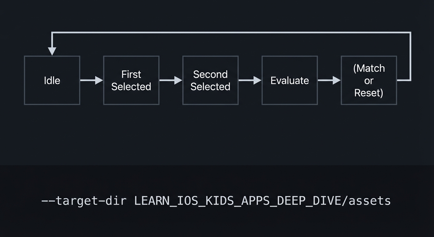
How It Works (Step-by-Step)
- Start in idle state with all cards face-down.
- On first tap, reveal card and move to first selected.
- On second tap, reveal card and move to second selected.
- Enter evaluation delay, disable input.
- If match, lock cards face-up. If not, flip both back.
- Return to idle.
Invariants:
- At most two cards are face-up during selection.
- Evaluation always occurs before next selection.
Failure modes:
- Third tap allowed during evaluation.
- Cards remain face-up after mismatch.
Minimal Concrete Example (Pseudocode)
STATE: selectedCards, matchedCards, inputEnabled

ON tapCard:
  IF inputEnabled == false: IGNORE
  IF card already matched: IGNORE
  REVEAL card
  ADD card to selectedCards
  IF selectedCards count == 2:
     inputEnabled = false
     EVALUATE match after delay
Common Misconceptions
- “Faster is better.” Too fast evaluation reduces learning.
- “More cards always increases fun.” Too many cards can overwhelm younger kids.
- “Hints reduce challenge.” Hints can support learning without removing challenge.
Check-Your-Understanding Questions
- Why should input be disabled during evaluation?
- How does a preview mode help younger kids?
- What is the risk of variable evaluation timing?
Check-Your-Understanding Answers
- It prevents a third card from being selected and breaking the state model.
- It provides a fair memory baseline and reduces frustration.
- It creates unpredictability, which feels unfair to children.
Real-World Applications
- Memory training apps
- Classroom matching games
- Cognitive development tools
Where You Will Apply It
- In this project: see Section 3.7 Real World Outcome and Section 5.10 Implementation Phases.
- Also used in: Project 2 for state transitions.
References
- “Head First Design Patterns” by Eric Freeman and Elisabeth Robson - Ch. 1
- “Design It!” by Michael Keeling - Ch. 2
Key Insight
Explicit state machines keep multi-step interactions stable and predictable.
Summary
A memory match game is a textbook example of a two-step selection state machine. The key is to separate input, evaluation, and feedback so the child always knows what is happening.
Homework / Exercises to Practice the Concept
- Draw the state transitions and mark when input should be disabled.
- Decide how long the evaluation delay should be and why.
- Design a hint rule that helps after repeated mismatches.
Solutions to the Homework / Exercises
- Input disabled after second selection until evaluation complete.
- A delay of 800-1200ms gives time to see the cards.
- After 3 mismatches, flash the correct pair briefly.
3. Project Specification
3.1 What You Will Build
A memory match game with 8-16 cards, flipping animations, gentle mismatch feedback, and progress tracking.
3.2 Functional Requirements
- Card grid: Display a grid of face-down cards.
- Flip interaction: Tap to reveal a card.
- Evaluation: After two cards, determine match or mismatch.
- Feedback: Celebrate matches and gently reset mismatches.
- Progress: Show remaining pairs.
3.3 Non-Functional Requirements
- Performance: Animations smooth and consistent.
- Reliability: No overlapping card states.
- Usability: Tap targets large and spaced.
3.4 Example Usage / Output
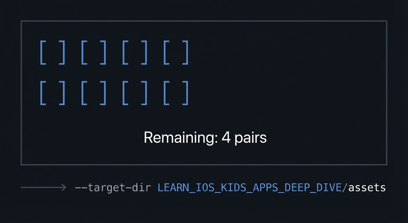
ASCII wireframe:
+----------------------------------+
| [ ][ ][ ][ ]                     |
| [ ][ ][ ][ ]                     |
|                                  |
| Remaining: 4 pairs               |
+----------------------------------+
3.5 Data Formats / Schemas / Protocols
- Card: { id, face_asset, is_matched, is_revealed }
- GameState: { selected_ids, matched_ids, remaining_pairs }
3.6 Edge Cases
- Tapping same card twice
- Tapping while cards are flipping back
- Final match with delayed animation
3.7 Real World Outcome
3.7.1 How to Run (Copy/Paste)
- Open project in Xcode.
- Run on iPad simulator for grid space.
3.7.2 Golden Path Demo (Deterministic)
Scenario: Select two matching cards.
Expected behavior:
- Both cards remain face-up with a short celebration.
- Remaining pairs count decreases by one.
3.7.3 Failure Demo (Deterministic)
Scenario: Select two non-matching cards.
Expected behavior:
- Cards stay visible briefly, then flip back.
- A gentle “try again” sound plays.
3.7.4 Mobile UI Details
- Large card grid centered on screen.
- Remaining pairs indicator at bottom.
4. Solution Architecture
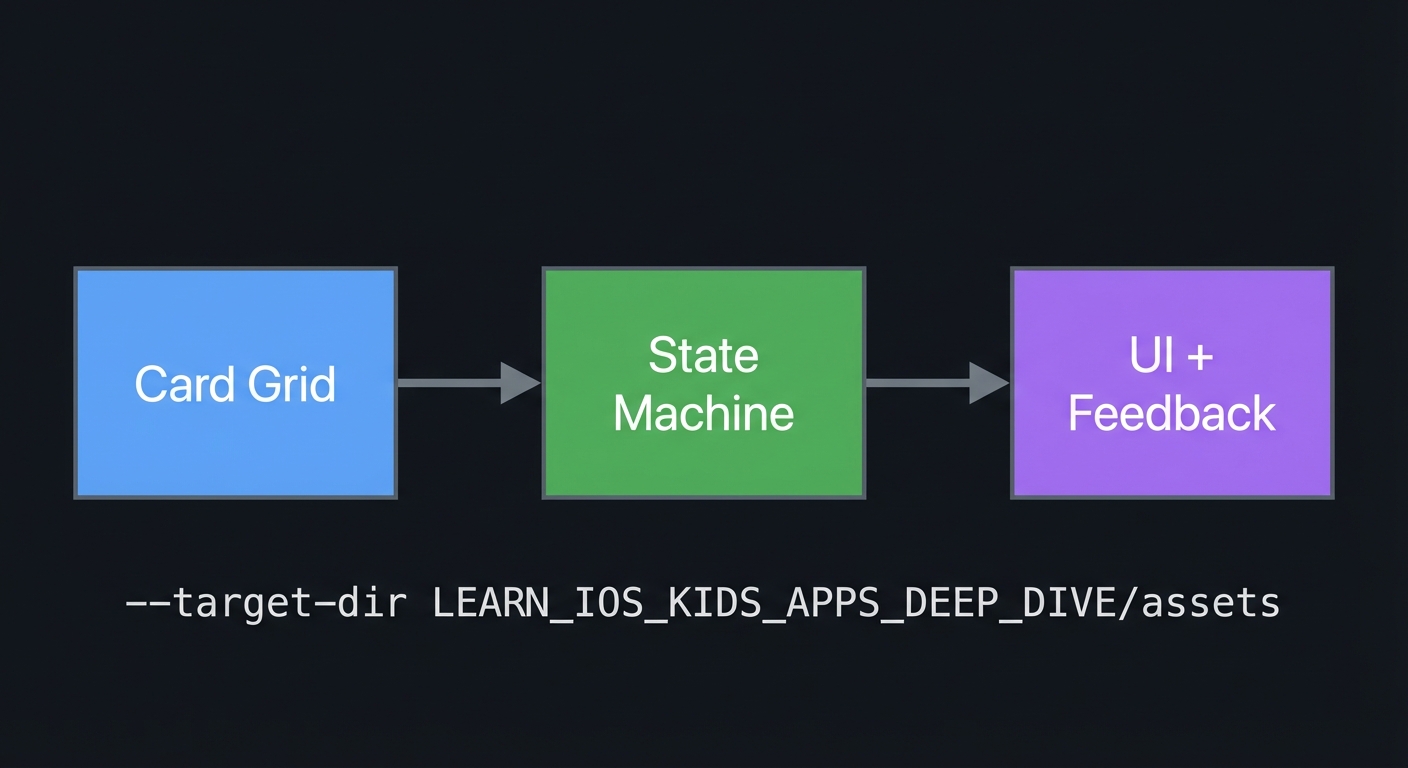
4.1 High-Level Design
+-------------+      +------------------+      +------------------+
| Card Grid   | ---> | State Machine    | ---> | UI + Feedback    |
+-------------+      +------------------+      +------------------+
4.2 Key Components
| Component | Responsibility | Key Decisions |
|---|---|---|
| Card Model | Tracks card states | Explicit flags |
| State Machine | Controls selection flow | Input lockout |
| Feedback Layer | Animations and sounds | Gentle timing |
4.3 Data Structures (No Full Code)
- SelectedIds: list of two ids
- MatchedIds: set of ids
4.4 Algorithm Overview
Key Algorithm: Match Evaluation
- After two selections, compare ids.
- If match, mark matched.
- If mismatch, reset after delay.
Complexity Analysis:
- Time: O(1) per evaluation
- Space: O(N) for cards
5. Implementation Guide
5.1 Development Environment Setup
xcodebuild -version
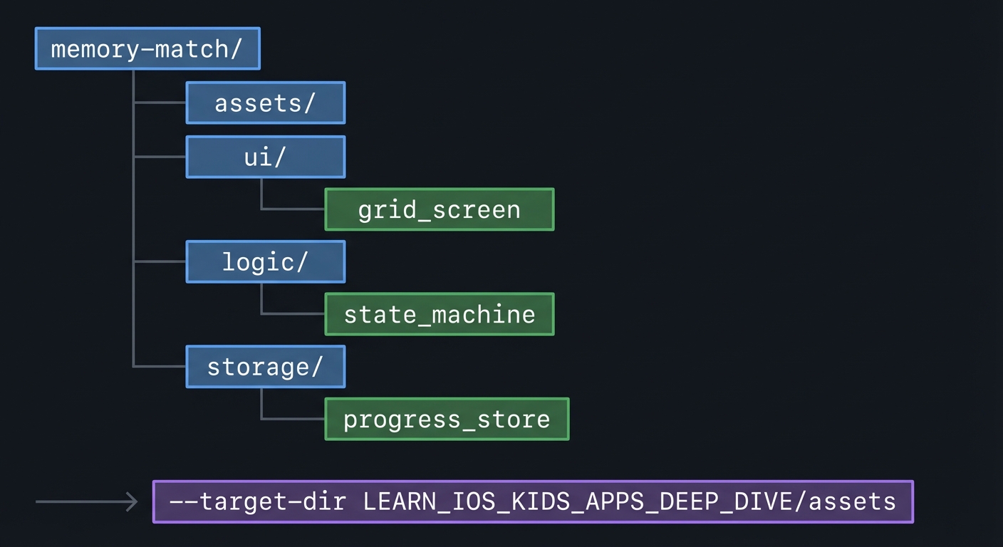
5.2 Project Structure
memory-match/
+-- assets/
+-- ui/
|   `-- grid_screen
+-- logic/
|   `-- state_machine
`-- storage/
    `-- progress_store
5.3 The Core Question You’re Answering
“How do I prevent chaos in a two-step selection game?”
5.4 Concepts You Must Understand First
- State machine design
- Why do you need explicit states?
- Book Reference: “Head First Design Patterns” - Ch. 1
- Feedback timing
- How long should cards stay visible?
- Book Reference: “Design It!” - Ch. 2
5.5 Questions to Guide Your Design
- Selection flow
- What happens if the same card is tapped twice?
- When does input unlock?
- Progress display
- How do you show remaining pairs clearly?
5.6 Thinking Exercise
State Transition Map
Draw the full state flow and mark where input is disabled.
5.7 The Interview Questions They’ll Ask
- “Why are state machines helpful for UI?”
- “How do you avoid race conditions in tap interactions?”
- “What is a good evaluation delay?”
- “How do you scale difficulty?”
- “How do you test this game deterministically?”
5.8 Hints in Layers
Hint 1: Lock input after second tap Prevent extra taps during evaluation.
Hint 2: Use a timer Delay the flip back consistently.
Hint 3: Add preview mode Show all cards briefly at start.
Hint 4: Debug logs Log every state transition.
5.9 Books That Will Help
| Topic | Book | Chapter |
|---|---|---|
| Patterns | “Head First Design Patterns” | Ch. 1 |
5.10 Implementation Phases
Phase 1: Foundation (3-5 hours)
Goals:
- Grid layout
- Card flip logic
Tasks:
- Render a grid of cards.
- Flip a card on tap.
Checkpoint: One card flips correctly.
Phase 2: Core Functionality (6-8 hours)
Goals:
- Two-card evaluation
- Match logic
Tasks:
- Compare two selected cards.
- Lock input during evaluation.
Checkpoint: Match and mismatch flow works.
Phase 3: Polish & Edge Cases (4-6 hours)
Goals:
- Add preview mode
- Add progress indicator
Tasks:
- Implement preview reveal.
- Show remaining pairs.
Checkpoint: Round completes smoothly.
5.11 Key Implementation Decisions
| Decision | Options | Recommendation | Rationale |
|---|---|---|---|
| Evaluation delay | Short vs long | Medium | Balanced pacing |
| Grid size | 2x4 vs 4x4 | 2x4 for young, 4x4 for older | Age fit |
| Preview | On vs off | On for younger kids | Reduces frustration |
6. Testing Strategy
6.1 Test Categories
| Category | Purpose | Examples |
|---|---|---|
| Unit | Match logic | Compare ids |
| Integration | State flow | Lockout timing |
| Edge Case | Double tap | Same card twice |
6.2 Critical Test Cases
- Tap same card twice should not count as match.
- Tap third card during evaluation should be ignored.
- Final match triggers completion.
6.3 Test Data
Pairs: cat, dog, star, moon
7. Common Pitfalls & Debugging
7.1 Frequent Mistakes
| Pitfall | Symptom | Solution |
|---|---|---|
| No lockout | Third card flips | Disable input |
| Too fast flip | No time to see | Increase delay |
| Tiny cards | Missed taps | Increase size |
7.2 Debugging Strategies
- Log selected ids and state transitions.
7.3 Performance Traps
- Heavy flip animations can drop frames.
8. Extensions & Challenges
8.1 Beginner Extensions
- Add themed card sets.
8.2 Intermediate Extensions
- Add difficulty levels with larger grids.
8.3 Advanced Extensions
- Add a parent stats view (local only).
9. Real-World Connections
9.1 Industry Applications
- Memory training apps
- Educational matching games
9.2 Related Open Source Projects
- Look for open source memory games for layout ideas.
9.3 Interview Relevance
- State machine reasoning
- UX timing decisions
10. Resources
10.1 Essential Reading
- “Head First Design Patterns” - Ch. 1
10.2 Video Resources
- Talks on interaction state modeling
10.3 Tools & Documentation
- Apple HIG for games
10.4 Related Projects in This Series
11. Self-Assessment Checklist
11.1 Understanding
- I can describe the state machine states.
- I can explain why input lockout matters.
- I can explain evaluation timing.
11.2 Implementation
- Match flow is stable.
- Edge cases are handled.
- Game completes cleanly.
11.3 Growth
- I can describe how to scale difficulty.
- I can explain the project in an interview.
12. Submission / Completion Criteria
Minimum Viable Completion:
- 8 cards with match logic
Full Completion:
- 16 cards with preview mode
Excellence (Going Above & Beyond):
- Multiple themes and parent stats