Project 1: Monthly Sales Report Automation
Build a system that transforms raw sales data into formatted Excel reports with charts and summaries.
Project Overview
You work at a company that receives daily sales transactions in CSV format. Every month, someone spends hours copying data into Excel, formatting it, creating pivot tables, and generating charts. Your task: automate this entirely.
What You’ll Build
- A Python script that reads multiple CSV files (one per day)
- Combines them into a single Excel workbook with multiple sheets
- Applies professional formatting (fonts, colors, borders)
- Generates summary tables with totals and averages
- Creates embedded charts (bar chart for top products, line chart for daily trends)
- Saves the report with the current month’s name
Technologies
pandasfor data manipulationopenpyxlfor Excel file creation and formattingdatetimefor month/date handling
Learning Objectives
By completing this project, you will:
- Master pandas-Excel integration - Understand how DataFrames map to Excel sheets
- Apply professional formatting programmatically - Fonts, colors, borders, number formats
- Create embedded charts - Bar charts, line charts with proper data references
- Build multi-sheet workbooks - Organize data across logical sheet structures
- Automate file naming conventions - Dynamic naming based on dates
- Handle real-world data aggregation - Group, sum, average with pandas
Deep Theoretical Foundation
Understanding the Excel Object Model
Before you can automate Excel with Python, you need to understand how Excel organizes data internally. This knowledge directly translates to openpyxl’s API.
The Workbook-Worksheet-Cell Hierarchy
Workbook (the .xlsx file)
├── Worksheet 1 ("Raw Data")
│   ├── Cell A1 (value, style, formula)
│   ├── Cell A2
│   ├── Cell B1
│   └── ... (up to 16,384 columns × 1,048,576 rows)
├── Worksheet 2 ("Daily Summary")
│   └── ...
└── Worksheet 3 ("Charts")
    └── ...
Key insight: In openpyxl, you work with these same concepts:
Workbook()creates a new workbookwb.activeorwb.create_sheet()accesses worksheetsws['A1']orws.cell(row=1, column=1)accesses cells
Cell Properties You Can Control
Every Excel cell has multiple properties that affect its appearance and behavior:
| Property | Description | openpyxl Class |
|---|---|---|
| Value | The actual data (number, text, date) | Direct assignment |
| Font | Typeface, size, bold, italic, color | openpyxl.styles.Font |
| Fill | Background color and pattern | openpyxl.styles.PatternFill |
| Border | Lines around the cell | openpyxl.styles.Border |
| Alignment | Horizontal/vertical position, wrap | openpyxl.styles.Alignment |
| Number Format | How numbers display (“$#,##0.00”) | String code |
Example format codes:
"$#,##0.00"→ $1,234.56"0%"→ 85%"MMMM D, YYYY"→ December 27, 2024
pandas to Excel: The Data Bridge
When you use pandas.DataFrame.to_excel(), here’s what happens internally:
DataFrame in Memory          Excel File on Disk
┌──────────┬──────────┐      ┌──────────┬──────────┐
│  index   │  columns │      │  Row 1   │  Headers │
├──────────┼──────────┤  →   ├──────────┼──────────┤
│    0     │  data... │      │  Row 2   │  data... │
│    1     │  data... │      │  Row 3   │  data... │
└──────────┴──────────┘      └──────────┴──────────┘
Critical parameters for to_excel():
| Parameter | Default | Effect |
|---|---|---|
index=True |
Writes DataFrame index as first column | Set index=False to skip |
header=True |
Writes column names as first row | Set header=False to skip |
startrow=0 |
First row to write data | Use to leave space for titles |
startcol=0 |
First column to write data | Use to add margins |
Chart Data References
Excel charts reference cell ranges for their data. Understanding this is crucial for programmatic chart creation.
Chart Data Structure:
┌─────────────────────────────────────────────────┐
│  Categories: The labels on the X-axis           │
│  Example: Product names, dates, regions         │
│  Reference: Sheet1!$A$2:$A$11                   │
├─────────────────────────────────────────────────┤
│  Data Series: The values being plotted          │
│  Example: Sales amounts, counts, percentages    │
│  Reference: Sheet1!$B$2:$B$11                   │
├─────────────────────────────────────────────────┤
│  Titles: Series name for legend                 │
│  Reference: Sheet1!$B$1 (header cell)           │
└─────────────────────────────────────────────────┘
In openpyxl, you create these references using the Reference class:
from openpyxl.chart import Reference

# Data for the chart (values)
data = Reference(worksheet, min_col=2, min_row=1, max_row=11)

# Categories for X-axis (labels)
categories = Reference(worksheet, min_col=1, min_row=2, max_row=11)
Data Aggregation with pandas
Before creating reports, you need to aggregate raw transaction data. Here are the key patterns:
GroupBy Pattern
# Raw transactions: date, product, quantity, price
df.groupby('date').agg({
    'quantity': 'sum',      # Total units per day
    'price': ['sum', 'mean'] # Total revenue and average sale
})
Pivot Table Pattern
pd.pivot_table(df,
    values='revenue',
    index='date',
    columns='region',
    aggfunc='sum'
)
When to use which:
- groupby: When you want to aggregate by a single dimension
- pivot_table: When you need a matrix (rows × columns) view
The Core Question You’re Answering
“How do I transform Python data into a professional Excel document that looks like a human formatted it?”
This isn’t about just exporting data. Excel users expect formatting, colors, charts, and layout. You’re learning to be the bridge between Python’s data processing power and Excel’s business-friendly presentation layer.
Project Specification
Input Requirements
Your script should accept:
- A directory containing CSV files named
sales_YYYY_MM_DD.csv - Each CSV contains columns:
date,product,quantity,unit_price,region
Sample CSV structure:
date,product,quantity,unit_price,region
2024-12-01,Widget Pro,5,125.00,North
2024-12-01,Gadget Max,3,89.50,South
2024-12-01,Tool Elite,10,67.30,East
Output Requirements
Generate an Excel file named {MonthName}_{Year}_Sales_Report.xlsx containing:
- Raw Data sheet
- All transactions in a clean table
- Filters enabled on headers
- Alternating row colors
- Currency formatting for price/revenue columns
- Date formatting (e.g., “Dec 01, 2024”)
- Daily Summary sheet
- One row per day
- Columns: Date, Transaction Count, Total Revenue, Average Sale
- Totals row at bottom
- Line chart showing daily revenue trend
- Top Products sheet
- Top 10 products by total revenue
- Columns: Rank, Product, Units Sold, Revenue
- Horizontal bar chart
- Regional Analysis sheet
- Revenue breakdown by region
- Pie chart showing distribution
Functional Requirements
- Handle missing CSV files gracefully (log warning, continue)
- Validate data types (numeric columns should be numeric)
- Calculate derived fields (revenue = quantity × unit_price)
- Apply consistent professional styling throughout
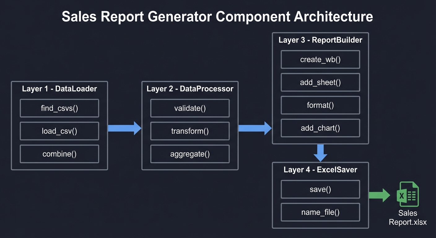
Solution Architecture
Component Design
┌─────────────────────────────────────────────────────────────────┐
│                     SALES REPORT GENERATOR                       │
├─────────────────────────────────────────────────────────────────┤
│                                                                   │
│  ┌──────────────┐     ┌──────────────┐     ┌──────────────┐     │
│  │   DataLoader │────►│ DataProcessor│────►│ ReportBuilder│     │
│  │              │     │              │     │              │     │
│  │ • find_csvs()│     │ • validate() │     │ • create_wb()│     │
│  │ • load_csv() │     │ • transform()│     │ • add_sheet()│     │
│  │ • combine()  │     │ • aggregate()│     │ • format()   │     │
│  └──────────────┘     └──────────────┘     │ • add_chart()│     │
│                                            └──────────────┘     │
│                                                   │               │
│                                                   ▼               │
│                                            ┌──────────────┐      │
│                                            │  ExcelSaver  │      │
│                                            │              │      │
│                                            │ • save()     │      │
│                                            │ • name_file()│      │
│                                            └──────────────┘      │
│                                                                   │
└─────────────────────────────────────────────────────────────────┘
Data Flow
Phase 1: EXTRACT
┌─────────────────────────────────────────────────────────────────┐
│ Input: Directory with CSV files                                  │
│ Process:                                                         │
│   1. Glob pattern: sales_*.csv                                  │
│   2. Sort files by date                                          │
│   3. Read each with pandas                                       │
│   4. Concatenate into single DataFrame                          │
│ Output: Combined DataFrame (all transactions)                    │
└─────────────────────────────────────────────────────────────────┘
                              │
                              ▼
Phase 2: TRANSFORM
┌─────────────────────────────────────────────────────────────────┐
│ Input: Combined DataFrame                                        │
│ Process:                                                         │
│   1. Validate columns exist                                      │
│   2. Convert date column to datetime                            │
│   3. Calculate revenue (quantity × unit_price)                  │
│   4. Create aggregations:                                        │
│      - Daily summary (groupby date)                             │
│      - Product ranking (groupby product, sort)                  │
│      - Regional breakdown (groupby region)                      │
│ Output: Dictionary of DataFrames                                 │
└─────────────────────────────────────────────────────────────────┘
                              │
                              ▼
Phase 3: LOAD
┌─────────────────────────────────────────────────────────────────┐
│ Input: Dictionary of DataFrames                                  │
│ Process:                                                         │
│   1. Create workbook with ExcelWriter                           │
│   2. Write each DataFrame to its sheet                          │
│   3. Load workbook with openpyxl                                │
│   4. Apply formatting to each sheet                             │
│   5. Add charts to appropriate sheets                           │
│   6. Save with dynamic filename                                 │
│ Output: Formatted .xlsx file                                     │
└─────────────────────────────────────────────────────────────────┘
Styling Strategy
Define styles once, apply everywhere:
Style Definitions:
┌─────────────────────────────────────────────────────────────────┐
│ HEADER_STYLE                                                     │
│   Font: Bold, White, Size 11                                    │
│   Fill: Corporate Blue (#4472C4)                                │
│   Alignment: Center                                              │
│   Border: Thin bottom                                            │
├─────────────────────────────────────────────────────────────────┤
│ CURRENCY_FORMAT                                                  │
│   Number Format: "$#,##0.00"                                    │
├─────────────────────────────────────────────────────────────────┤
│ DATE_FORMAT                                                      │
│   Number Format: "MMM DD, YYYY"                                 │
├─────────────────────────────────────────────────────────────────┤
│ ALTERNATING_ROW                                                  │
│   Fill: Light Gray (#F2F2F2) on even rows                       │
├─────────────────────────────────────────────────────────────────┤
│ TOTAL_ROW                                                        │
│   Font: Bold                                                     │
│   Border: Thick top                                              │
│   Fill: Light Yellow (#FFEB9C)                                  │
└─────────────────────────────────────────────────────────────────┘
Phased Implementation Guide
Phase 1: Data Loading (Foundation)
Goal: Successfully read and combine all CSV files into a single DataFrame.
Tasks:
- Use
glob.glob()to find all matching CSV files - Read each file with
pd.read_csv() - Add a source file indicator (for debugging)
- Concatenate all DataFrames
- Validate the combined result
Checkpoint: You should be able to print the combined DataFrame and see all transactions with correct columns.
Common issues:
- Encoding errors: Try
encoding='utf-8'orencoding='latin-1' - Mixed date formats: Use
parse_dates=['date']or parse manually - Missing columns: Validate expected columns exist
Phase 2: Data Transformation (Processing)
Goal: Create all the aggregated DataFrames needed for each report sheet.
Tasks:
- Calculate revenue column:
df['revenue'] = df['quantity'] * df['unit_price'] - Create daily summary:
df.groupby('date').agg(...) - Create product ranking:
df.groupby('product').agg(...).nlargest(10) - Create regional breakdown:
df.groupby('region').agg(...) - Calculate totals for summary rows
Checkpoint: Each aggregated DataFrame should have the correct structure for its target sheet.
Common issues:
- Date column not recognized: Ensure it’s datetime type
- Decimal precision: Use
round(2)for currency values - Index handling: Reset index after groupby for clean export
Phase 3: Basic Excel Export (Structure)
Goal: Create a multi-sheet workbook with all data, no formatting yet.
Tasks:
- Create
pd.ExcelWriterwithengine='openpyxl' - Write each DataFrame to its sheet with
to_excel() - Set appropriate sheet names
- Save the workbook
Checkpoint: Open the Excel file and verify all sheets contain correct data.
Common issues:
- Sheet name too long: Max 31 characters
- Index appearing as column: Use
index=False - Overwriting sheets: Use
if_sheet_exists='replace'mode
Phase 4: Professional Formatting (Polish)
Goal: Transform raw data export into a professional-looking report.
Tasks:
- Load the workbook with
openpyxl.load_workbook() - Define style objects (Font, Fill, Border, Alignment)
- Apply header styling to row 1 of each sheet
- Apply number formats to currency columns
- Apply date formats to date columns
- Add alternating row colors
- Enable filters on data tables
- Adjust column widths
Checkpoint: The report should look professionally formatted when opened.
Common issues:
- Styles not applying: Make sure you save after formatting
- Wrong cells styled: Double-check row/column references
- Filters not visible: May need to enable in Excel manually first time
Phase 5: Charts and Visuals (Insights)
Goal: Add meaningful charts that visualize the data.
Tasks:
- Create line chart for daily revenue trend
- Create bar chart for top products
- Create pie chart for regional distribution
- Position charts appropriately (not overlapping data)
- Add chart titles and legend
Checkpoint: Charts should render correctly and show accurate data.
Common issues:
- Chart showing wrong data: Verify Reference ranges
- Chart too small/large: Set width/height properties
- Legend overlapping: Adjust legend position
Testing Strategy
Unit Tests
Test individual components in isolation:
# Test data loading
def test_find_csv_files():
    files = find_csv_files('test_data/')
    assert len(files) == 5
    assert all(f.endswith('.csv') for f in files)

# Test aggregation
def test_daily_summary():
    test_df = pd.DataFrame({
        'date': ['2024-12-01', '2024-12-01', '2024-12-02'],
        'revenue': [100, 200, 150]
    })
    summary = create_daily_summary(test_df)
    assert summary.loc['2024-12-01', 'revenue'] == 300
    assert summary.loc['2024-12-02', 'revenue'] == 150
Integration Tests
Test the complete pipeline:
def test_full_report_generation():
    # Create test CSV files
    create_test_csvs('test_data/')

    # Run the report generator
    generate_report('test_data/', 'test_output/')

    # Verify output
    assert os.path.exists('test_output/December_2024_Sales_Report.xlsx')

    # Verify content
    wb = load_workbook('test_output/December_2024_Sales_Report.xlsx')
    assert 'Raw Data' in wb.sheetnames
    assert 'Daily Summary' in wb.sheetnames
    assert wb['Raw Data'].max_row > 1  # Has data beyond header
Visual Verification Checklist
- Headers are bold and colored
- Currency columns show $ signs
- Dates are human-readable
- Charts display correctly
- Filters are enabled
- Column widths accommodate data
- Totals row is visually distinct
Common Pitfalls and Debugging
Pitfall 1: DataFrame Index Written to Excel
Symptom: An extra column appears with row numbers.
Cause: pandas writes the index by default.
Solution: df.to_excel(writer, index=False)
Pitfall 2: Styles Don’t Persist
Symptom: Formatting code runs without error, but Excel shows unformatted data.
Cause: Not saving the workbook after applying styles.
Solution: Always call wb.save(filename) after formatting.
Pitfall 3: Chart Shows Empty or Wrong Data
Symptom: Chart appears but shows no bars/lines, or shows incorrect values.
Cause: Reference ranges are incorrect.
Solution: Print your Reference objects to verify:
data_ref = Reference(ws, min_col=2, min_row=1, max_row=11)
print(f"Data range: {data_ref}")  # Should show actual cell range
Pitfall 4: Memory Error on Large Files
Symptom: Script crashes when processing many/large CSV files.
Cause: Loading all data into memory at once.
Solution: Process in chunks:
chunks = []
for csv_file in csv_files:
    chunk = pd.read_csv(csv_file, chunksize=10000)
    for c in chunk:
        chunks.append(c)
df = pd.concat(chunks)
Pitfall 5: Encoding Errors
Symptom: UnicodeDecodeError when reading CSV.
Cause: File has non-UTF-8 characters.
Solution: Try different encodings:
try:
    df = pd.read_csv(file, encoding='utf-8')
except UnicodeDecodeError:
    df = pd.read_csv(file, encoding='latin-1')
Extensions and Challenges
Extension 1: Email Integration
Automatically email the report when generation completes.
Skills practiced: SMTP, email attachments, scheduling
Extension 2: Comparative Analysis
Add a sheet comparing this month to previous months.
Skills practiced: Historical data loading, percentage calculations, trend analysis
Extension 3: Interactive Filters
Add Excel slicers for filtering by region or product category.
Skills practiced: Advanced Excel features, pivot tables
Extension 4: Data Validation
Add dropdown lists for future data entry in the Excel file.
Skills practiced: Data validation rules, list references
Extension 5: Template-Based Generation
Use an existing Excel template instead of creating from scratch.
Skills practiced: Template modification, preserving existing formatting
Real-World Connections
Industry Applications
- Retail: Daily sales reports for store managers
- Finance: Monthly transaction summaries for accounting
- Manufacturing: Production output reports
- Healthcare: Patient visit summaries
Career Relevance
This project demonstrates skills used in:
- Business Intelligence Developer roles
- Data Analyst positions
- Automation Engineer positions
- Financial Analyst roles
Portfolio Value
When presenting this project:
- Show before/after (manual vs automated)
- Quantify time savings (3 hours → 2 seconds)
- Highlight error reduction (zero human mistakes)
- Demonstrate scalability (works for any month)
Interview Questions
Prepare to answer these:
-
“What’s the difference between
pandas.ExcelWriterandopenpyxl.Workbook.save()?” -
“How would you handle a CSV file that’s too large to fit in memory?”
-
“Why might you use
xlsxwriterinstead ofopenpyxl?” -
“How do you preserve existing sheets when adding a new one to an Excel file?”
-
“What’s the difference between formula-based calculations and pre-calculated values?”
-
“How would you make your script idempotent (safe to run multiple times)?”
Hints by Layer
Layer 1: Getting Started
import pandas as pd
import glob

csv_files = glob.glob('sales_*.csv')
dfs = [pd.read_csv(f) for f in csv_files]
combined = pd.concat(dfs, ignore_index=True)
Layer 2: Multi-Sheet Export
with pd.ExcelWriter('report.xlsx', engine='openpyxl') as writer:
    combined.to_excel(writer, sheet_name='Raw Data', index=False)
    daily_summary.to_excel(writer, sheet_name='Daily Summary', index=False)
Layer 3: Applying Formatting
from openpyxl import load_workbook
from openpyxl.styles import Font, PatternFill

wb = load_workbook('report.xlsx')
ws = wb['Raw Data']

for cell in ws[1]:  # First row
    cell.font = Font(bold=True, color='FFFFFF')
    cell.fill = PatternFill(start_color='4472C4', end_color='4472C4', fill_type='solid')

wb.save('report.xlsx')
Layer 4: Creating Charts
from openpyxl.chart import BarChart, Reference

chart = BarChart()
data = Reference(ws, min_col=2, min_row=1, max_row=11)
categories = Reference(ws, min_col=1, min_row=2, max_row=11)
chart.add_data(data, titles_from_data=True)
chart.set_categories(categories)
ws.add_chart(chart, 'E2')
Layer 5: Dynamic Naming
from datetime import datetime

month_name = datetime.now().strftime('%B_%Y')
filename = f'{month_name}_Sales_Report.xlsx'
Self-Assessment Checklist
Before considering this project complete, verify:
- Script runs without errors
- All CSV files are processed
- Four sheets created with correct names
- Headers are professionally formatted
- Currency columns show proper format
- Dates are human-readable
- Daily trend chart displays correctly
- Top products bar chart is accurate
- Regional pie chart shows correct percentages
- Totals row calculates correctly
- Filename includes current month/year
- Code is modular and well-organized
- Error handling for missing files
- Output matches expected format
Resources
| Topic | Resource |
|---|---|
| pandas fundamentals | “Python for Data Analysis” by Wes McKinney - Ch. 5-6 |
| Reading/writing Excel with pandas | “Python for Data Analysis” by Wes McKinney - Ch. 6.3 |
| Excel automation with openpyxl | “Automate the Boring Stuff with Python” by Al Sweigart - Ch. 13 |
| Data aggregation and grouping | “Python for Data Analysis” by Wes McKinney - Ch. 10 |
| Chart creation with openpyxl | openpyxl official documentation - Charts section |
| Professional Python code structure | “Clean Code” by Robert C. Martin - Ch. 2-3 |